Case study · AbitaPublished
One place to run a smart home and see what it costs
A smart home usually comes with one app per brand of device, and the energy bill arrives a month later with no detail. Abita brings heating, lights, locks, cameras, and media into one dashboard. It shows energy use in euros as it happens and puts whatever needs attention at the top.
- Web app
- Smart home
- IoT
- Product design
- UX & UI
- Dashboard design
At a glance
- Platform
- Web, desktop
- Who it's for
- Households running a smart home
- Our role
- Product design, UX, UI, prototype
- Year
- 2026
The problem
The more devices a home has, the harder it is to run. Each brand has its own app, every alert looks equally urgent, and nobody in the house knows what the heating costs. We designed Abita for the person who runs the home and for everyone else who lives there.
- 01
One app per device
Lights, thermostat, locks, and cameras each come with their own app, so running the home means switching between five of them.
- 02
Every alert looks the same
A low battery and an unlocked door arrive with the same buzz, and the important one gets missed.
- 03
Energy you can't see
People get a bill at the end of the month, but can't see which device used what or when power is cheapest.
- 04
Everyone shares one login
Partners, children, grandparents, and guests need different access, but most systems give everyone the same keys.
How we approached it
- 01
Lead with what needs attention
The overview opens with alerts, then climate, energy, and security.
- 02
Energy in euros
With the tariff entered once, usage shows as money, and appliances can run in the cheapest hours.
- 03
Setup in about ten minutes
Seven guided steps cover the home, the hub, rooms, devices, energy, and the household, with the optional ones marked.
- 04
Access for each person
Everyone in the household gets their own sign-in, set to admin, member, or limited access.
Getting set up
The problemPairing devices and naming rooms is technical enough that many homes give up halfway.
What we did
- Each step explains why it asks. The city is used for sunrise, sunset, weather, and local tariff bands.
- The hub step explains that devices talk to it locally, so the home keeps working if the internet goes down.
- Devices are found automatically and placed in rooms, and anything unwanted can be switched off before it's added.
- Energy and household are optional, and the last step suggests a few automations to start with.
- Sign-up says the data is stored in the EU and can be downloaded or deleted at any time.
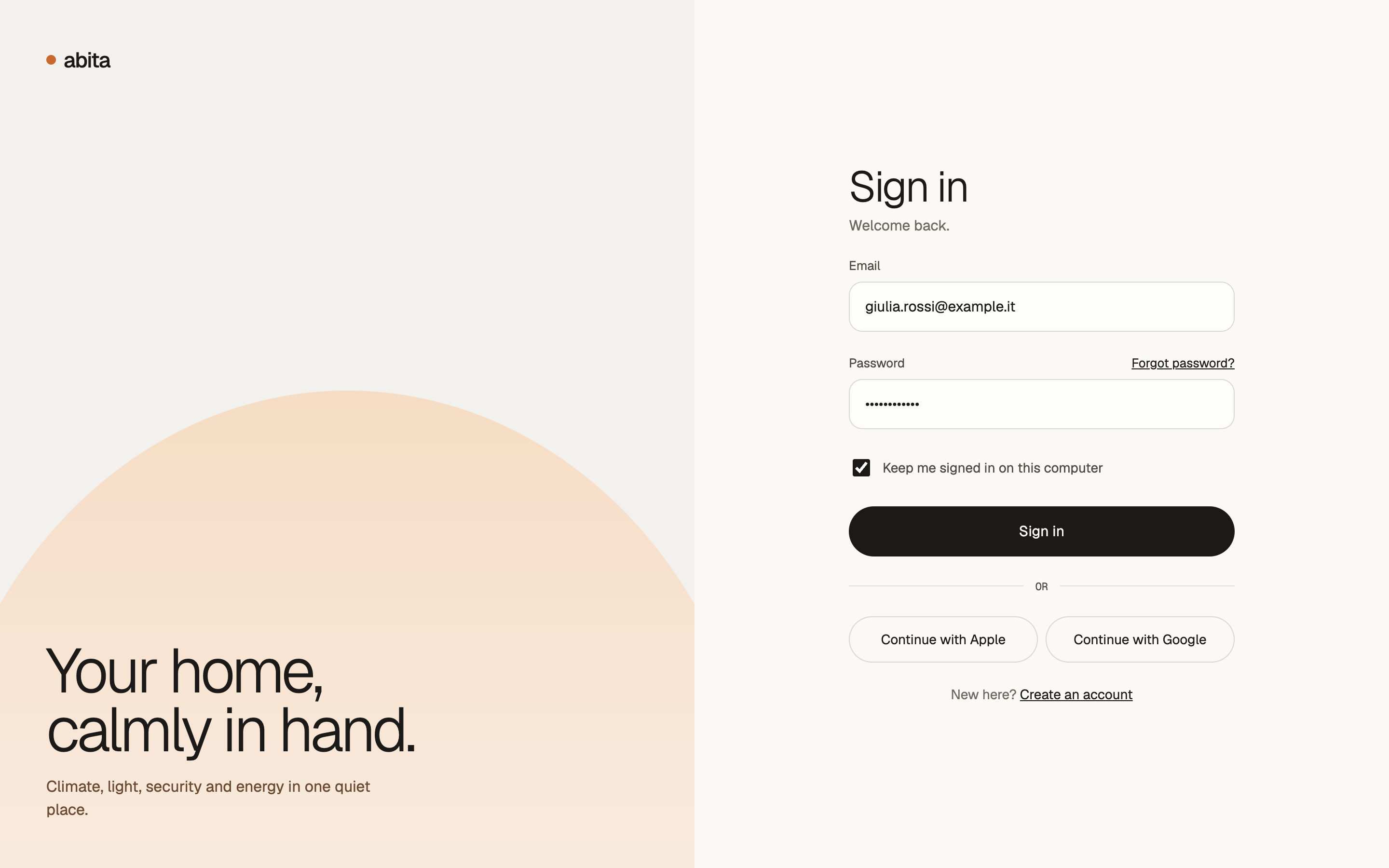
Sign inEmail, Apple, or Google. 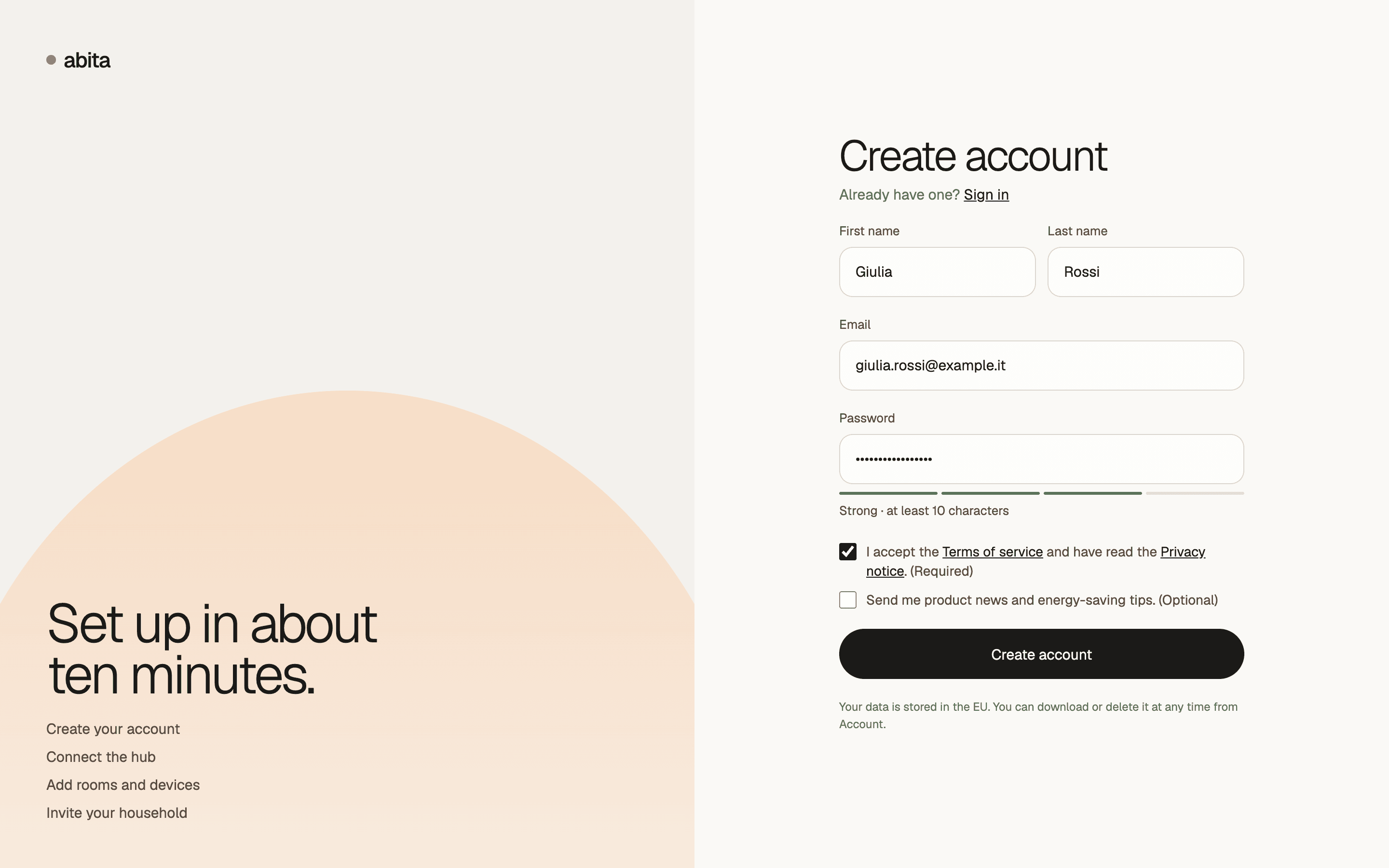
Create accountWhat setup involves, and where data is kept. 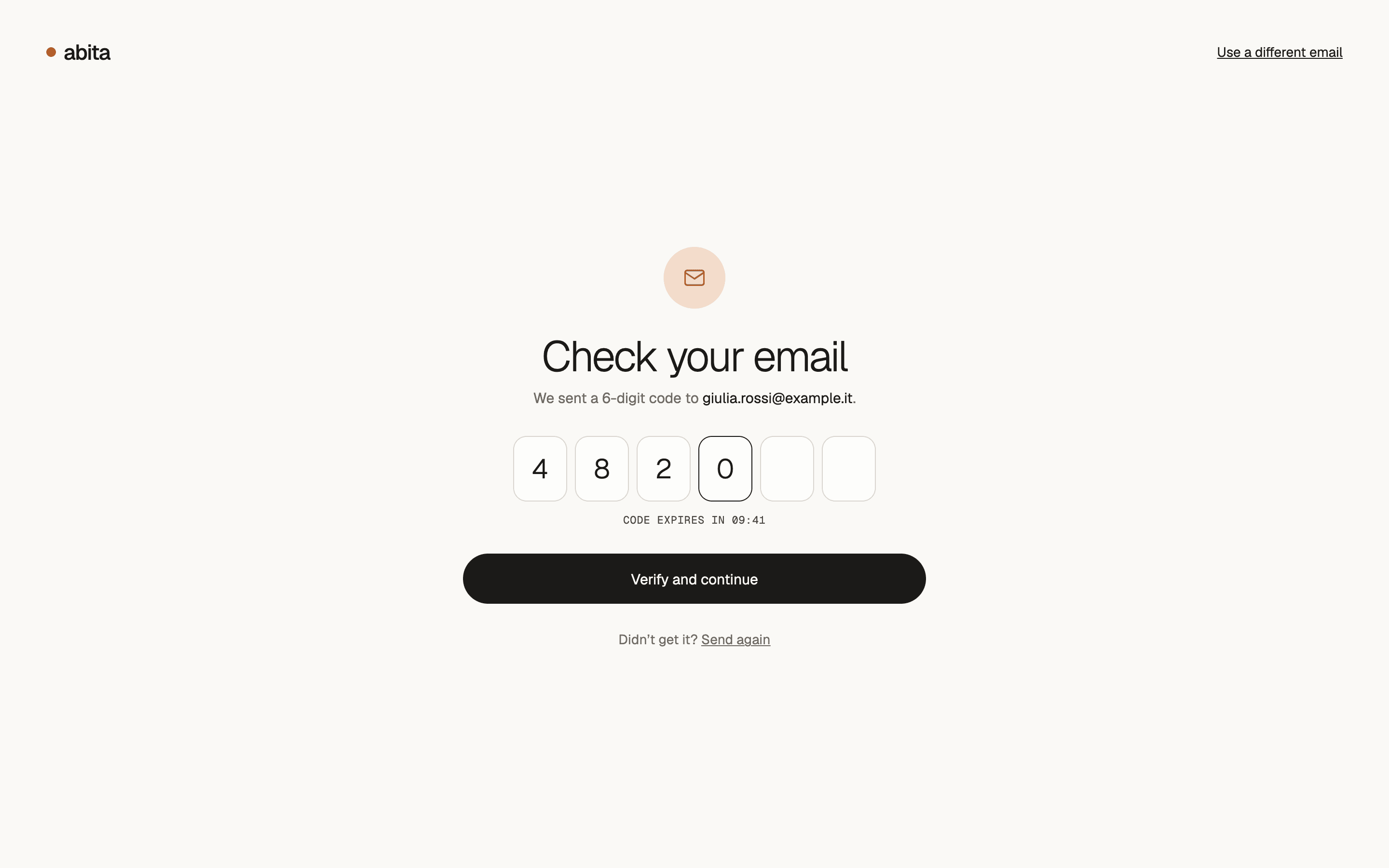
Verify emailA six-digit code that expires. 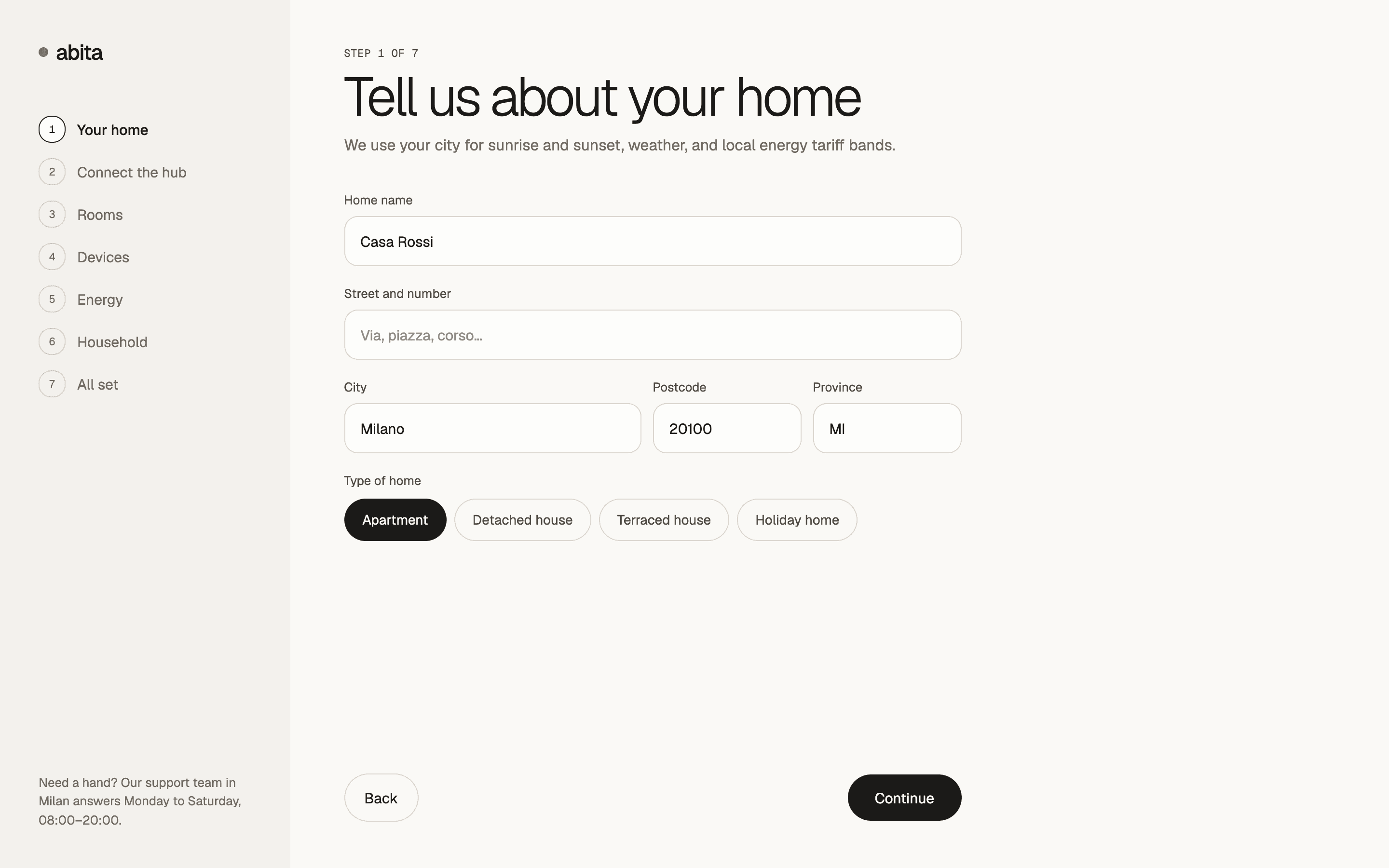
Your homeAddress and type of home, and why they matter. 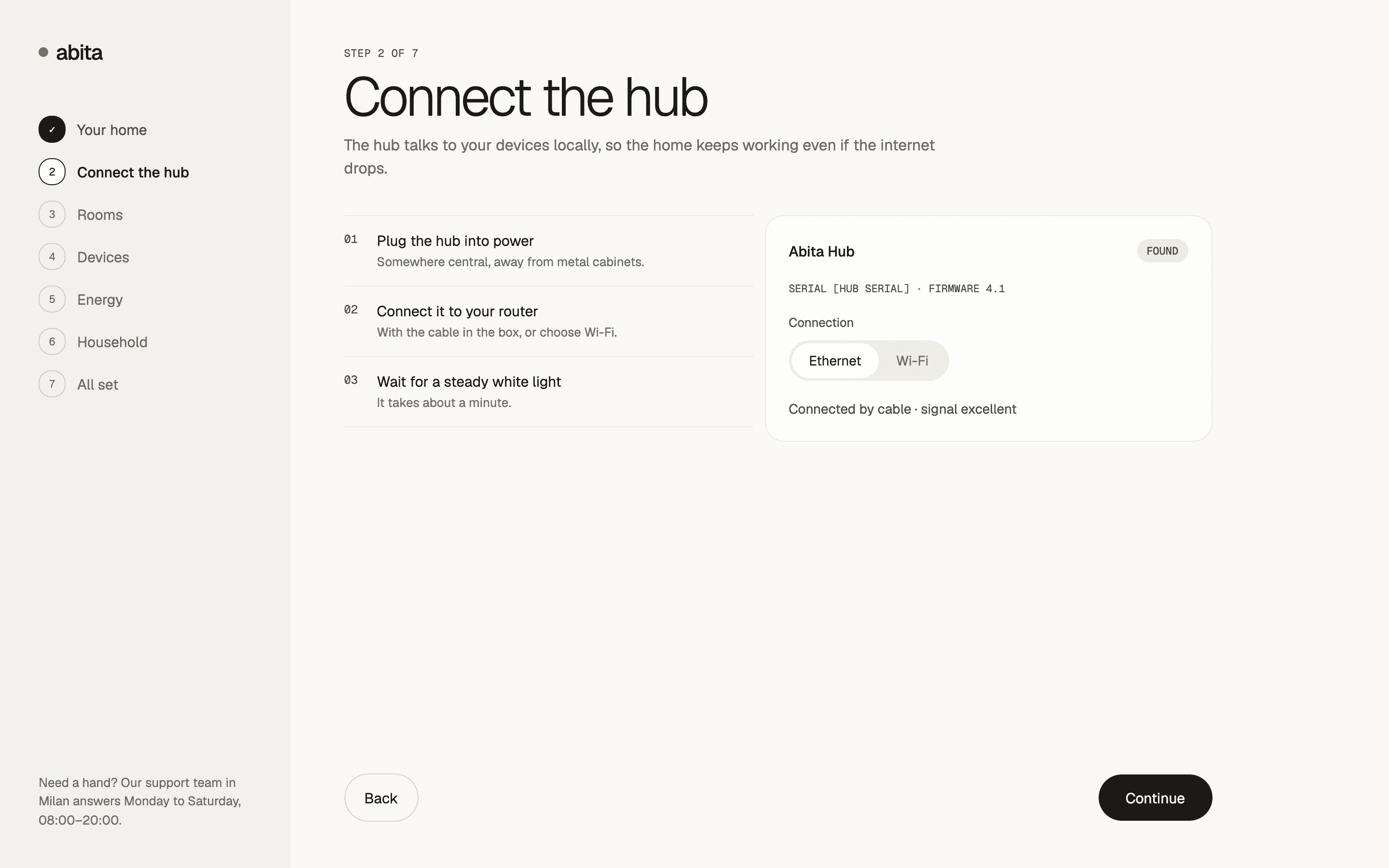
Connect the hubThree steps, and why the hub works offline. 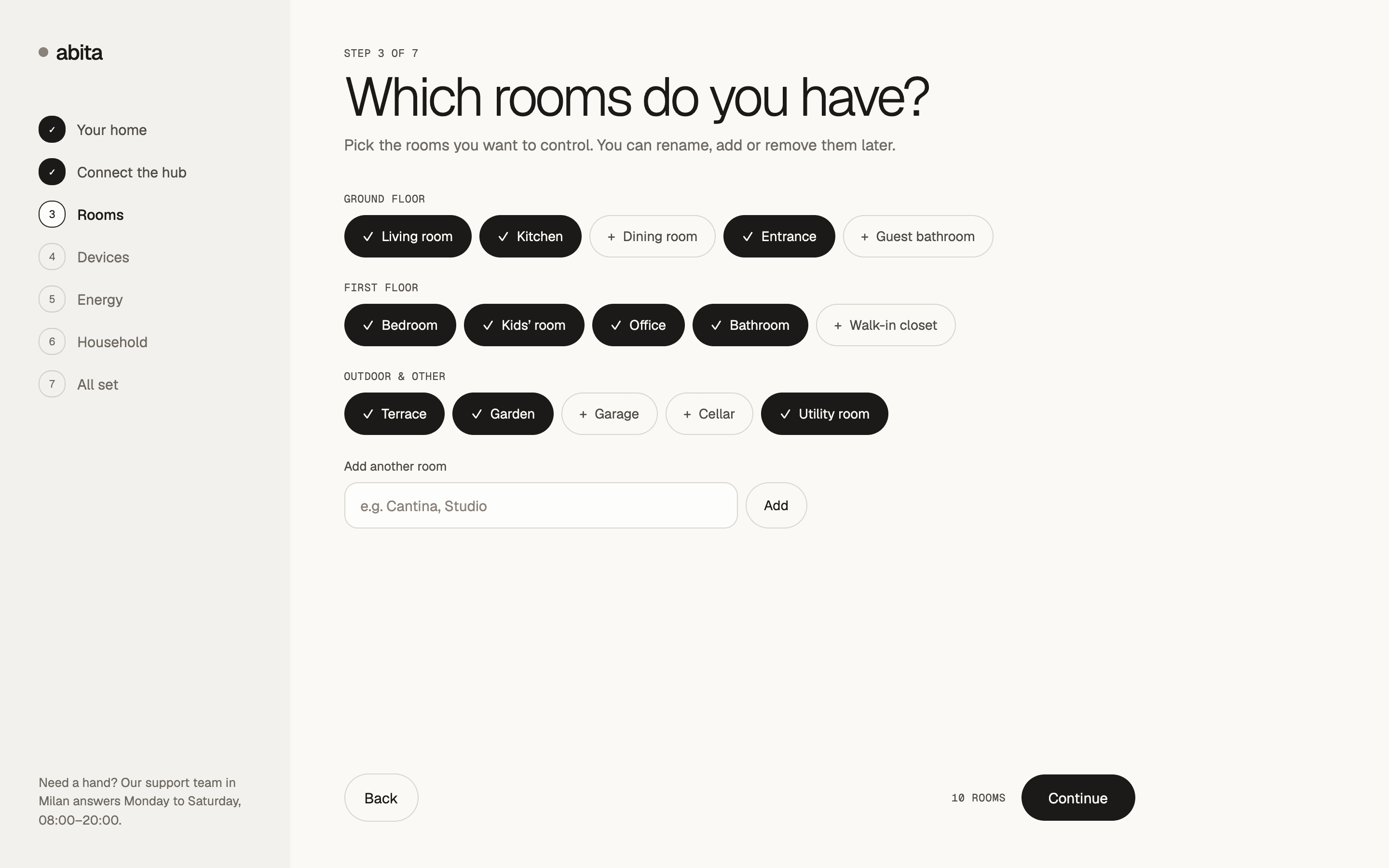
RoomsRooms by floor, renamed or added later. 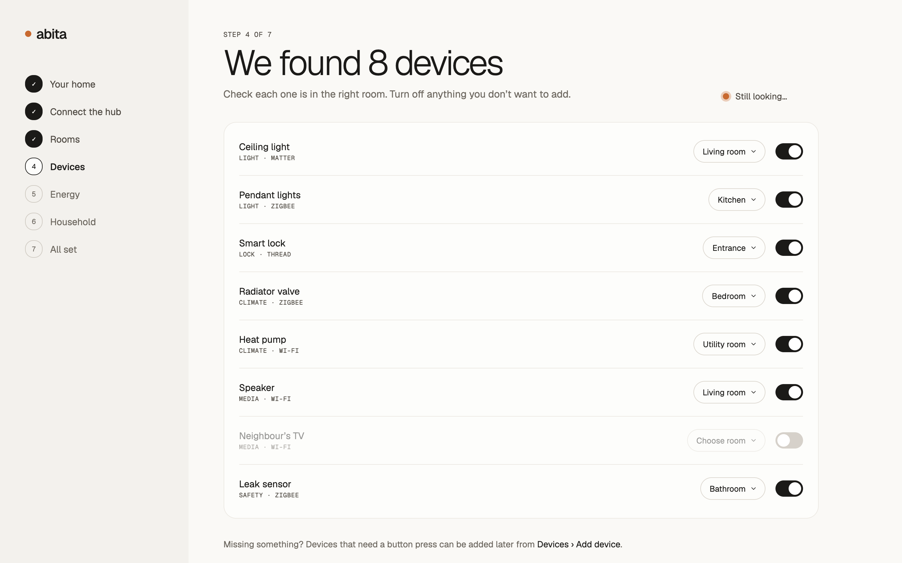
DevicesFound automatically and placed in rooms. 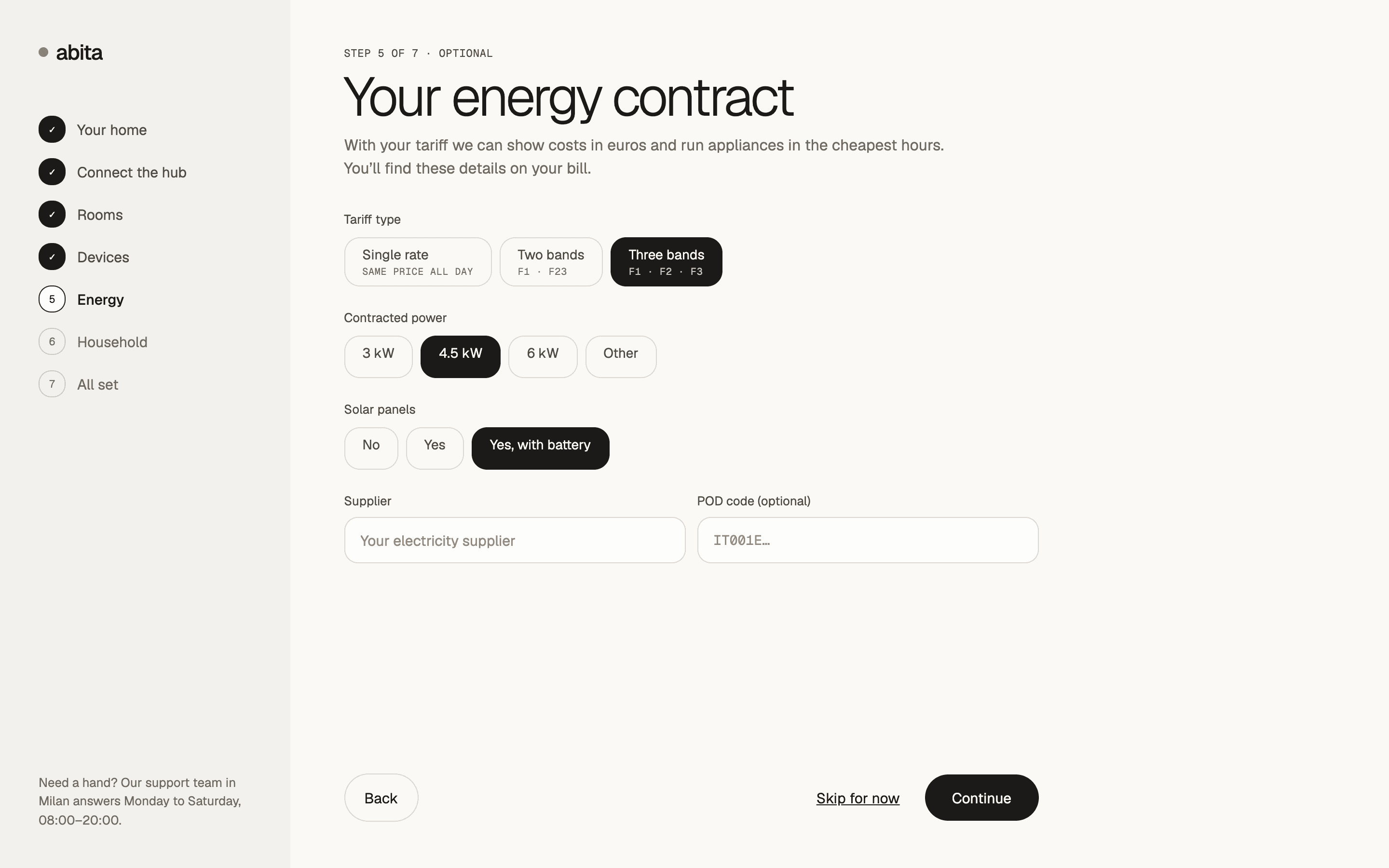
Energy contractTariff bands, so costs show in euros. 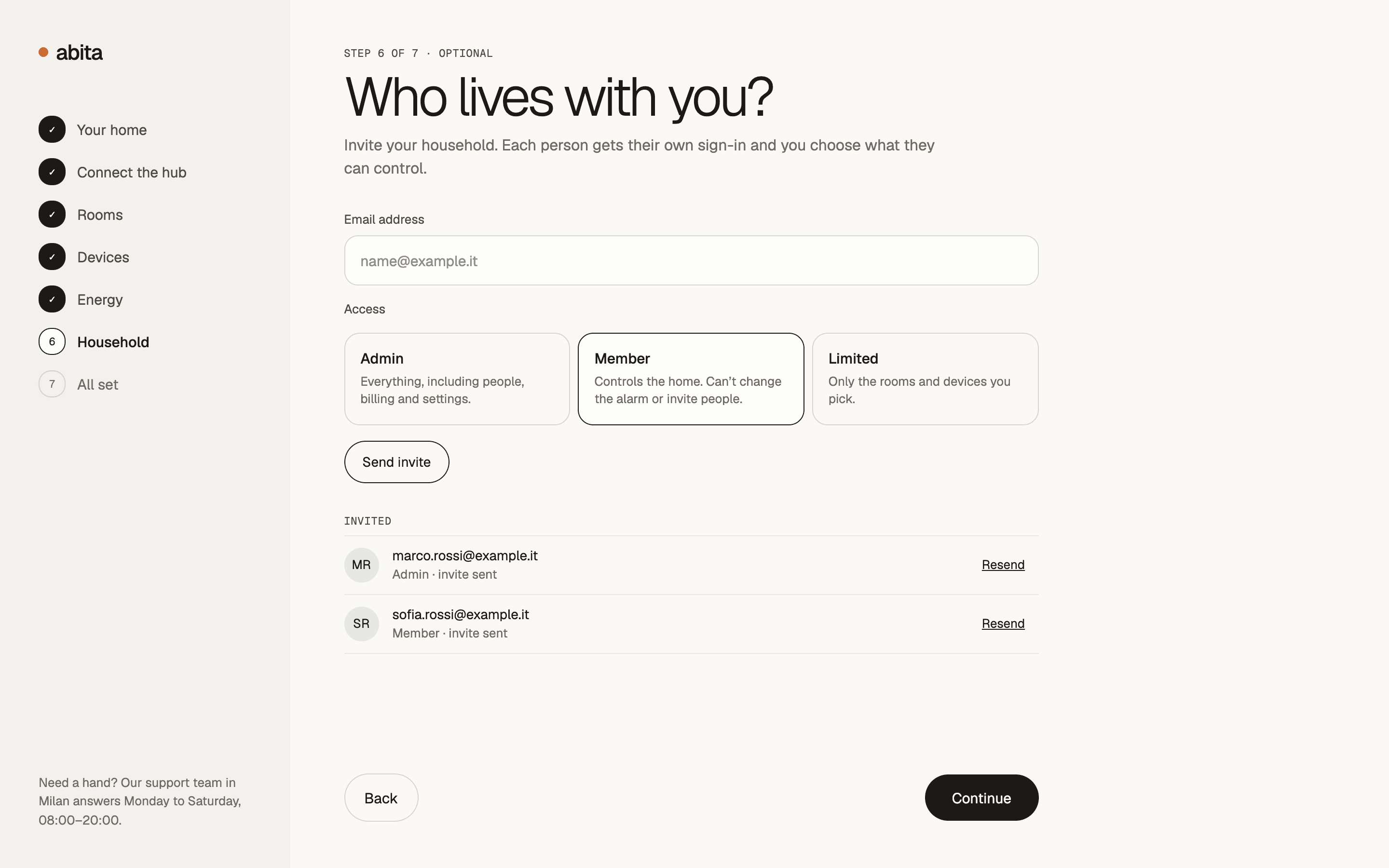
HouseholdInvites with access set per person. 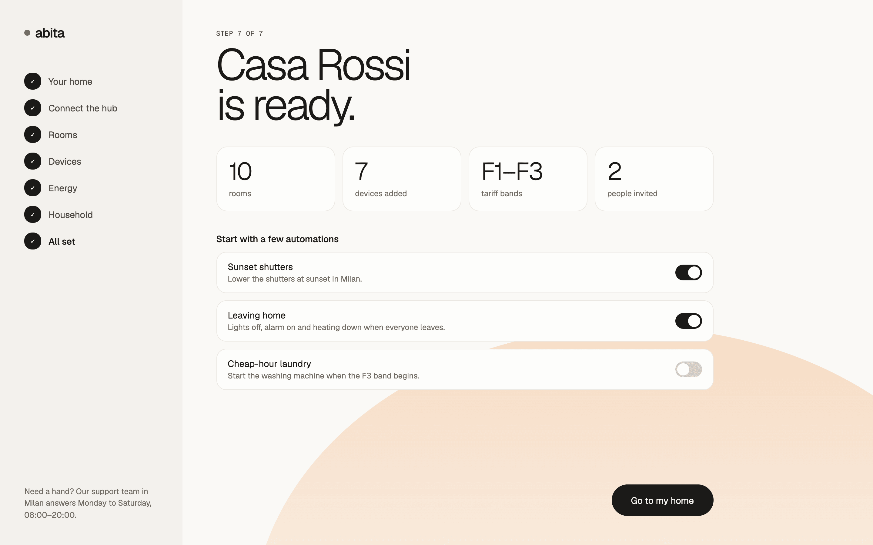
All setThe home summed up, with automations to start.
Everyday control
The problemChecking whether the door is locked or the heating is on shouldn't mean opening three apps.
What we did
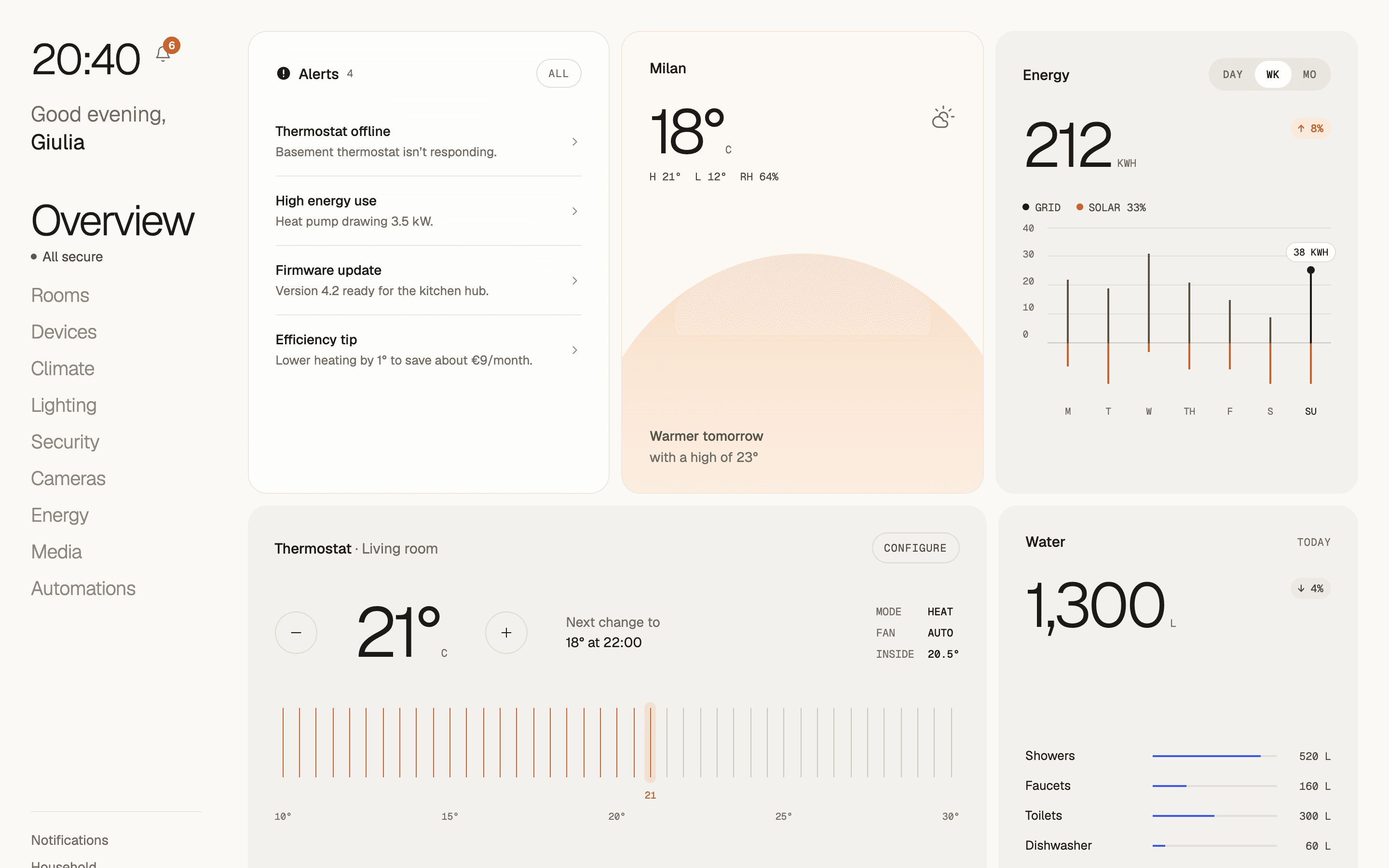
- The overview starts with alerts, like an offline thermostat or high energy use, next to the weather and a tip to save on heating.
- Climate works room by room, showing the target, the current temperature, and how long it will take to get there.
- Lighting runs on scenes like Evening or Movie, with brightness and color temperature for each room.
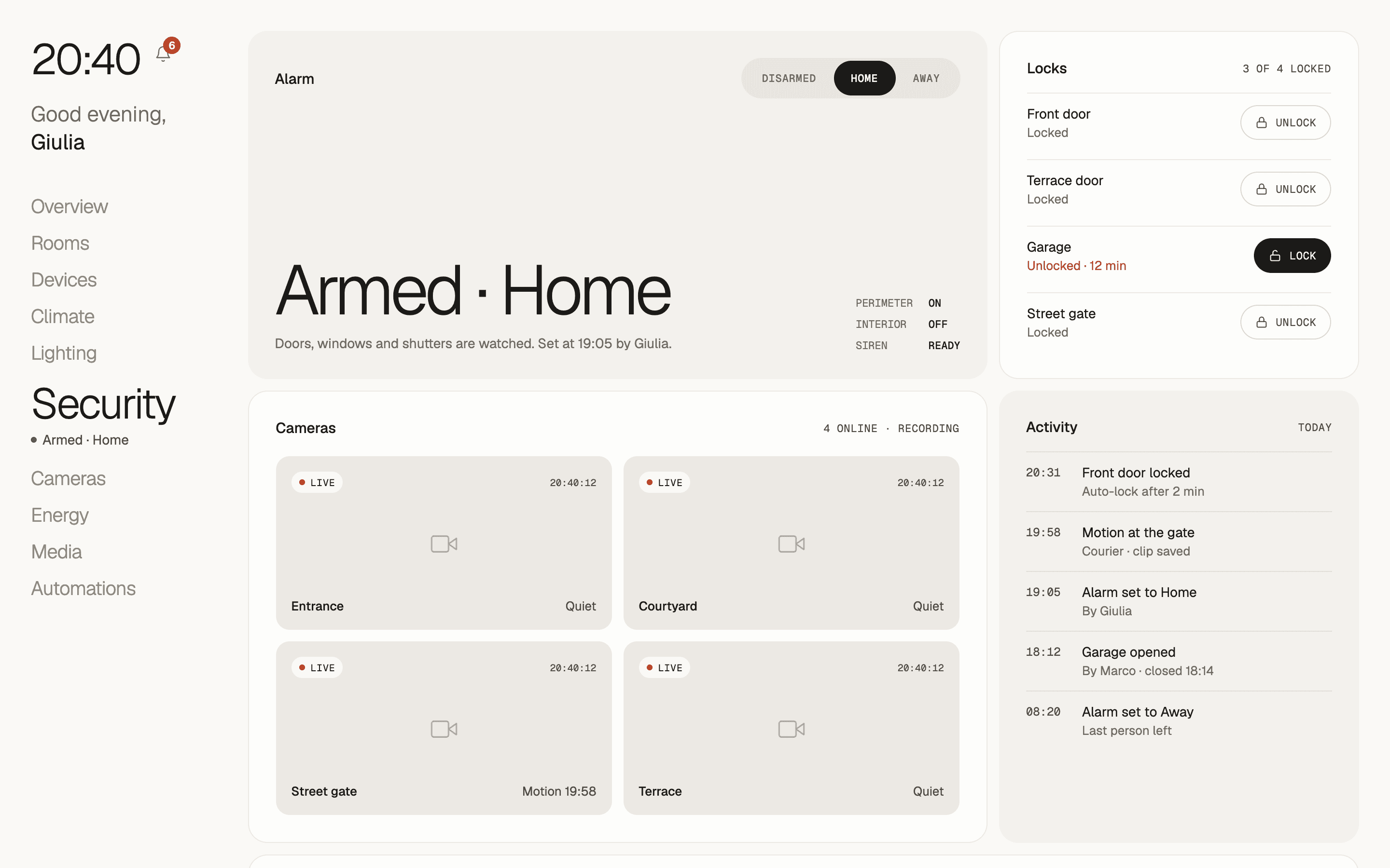
- Security shows the alarm mode, who set it and when, and every lock, with one tap to lock anything that's open.
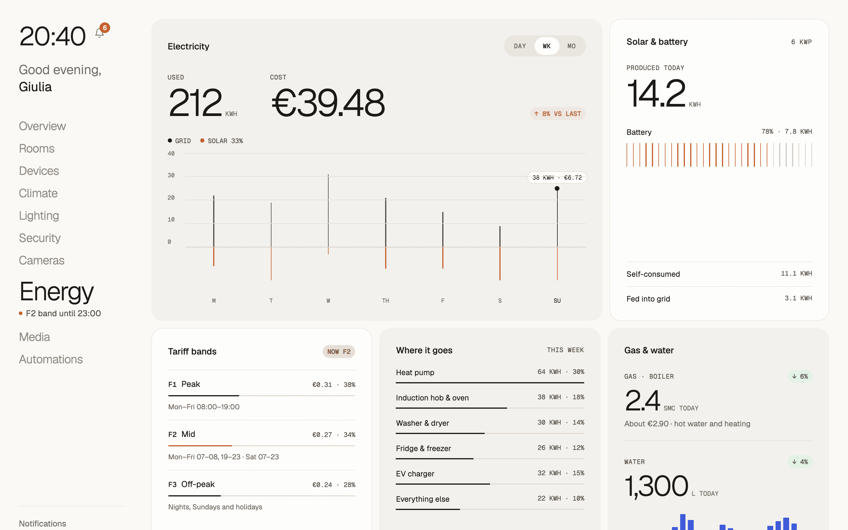
- Energy shows use and cost by day, week, and month, next to solar production and the battery.
OverviewAlerts first, then the rest of the home. 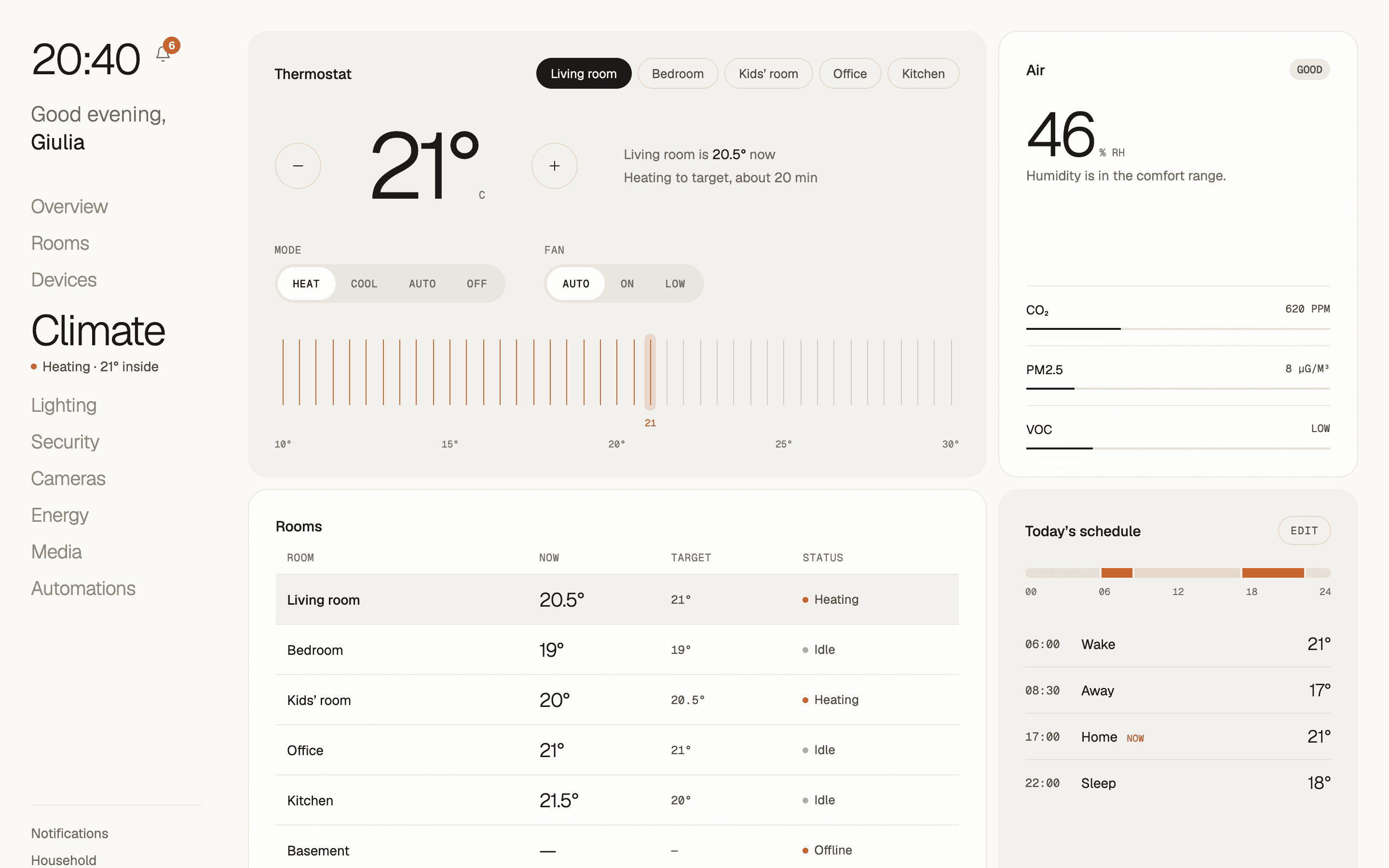
ClimateRoom by room, with time to target. 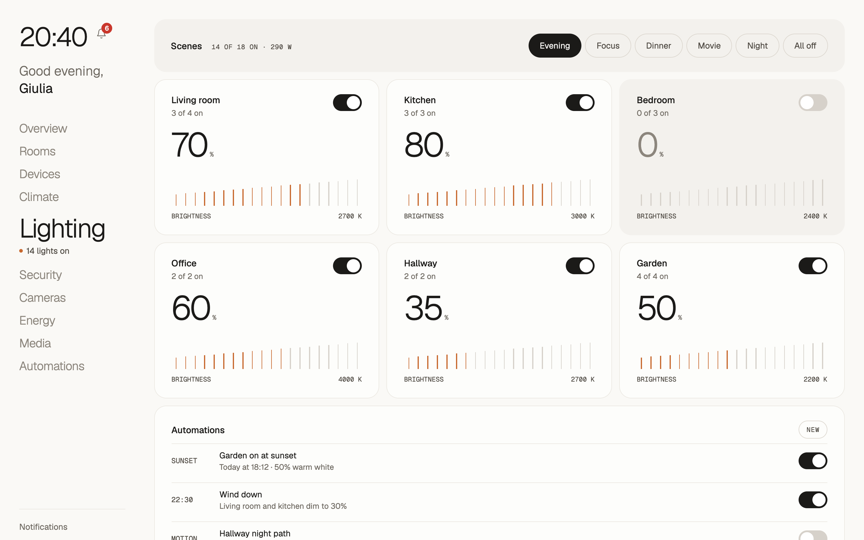
LightingScenes, brightness, and color temperature. SecurityAlarm mode, locks, and cameras. EnergyUsage in euros, solar, and battery.
Rooms and devices
The problemWith dozens of devices, it's hard to tell which one is offline, low on battery, or using the most power.
What we did
- A room page shows temperature, humidity, which devices are on, and the power being drawn right now.
- The device list flags what needs attention: offline, low battery, or an update waiting.
- A device page shows live power, efficiency, and today's cost, charted against the tariff bands.
- Cameras show a live feed with a 24-hour timeline of events, and media groups speakers across rooms.
- Adding a device starts with what it is, from a light to a leak sensor, or with a Matter code.
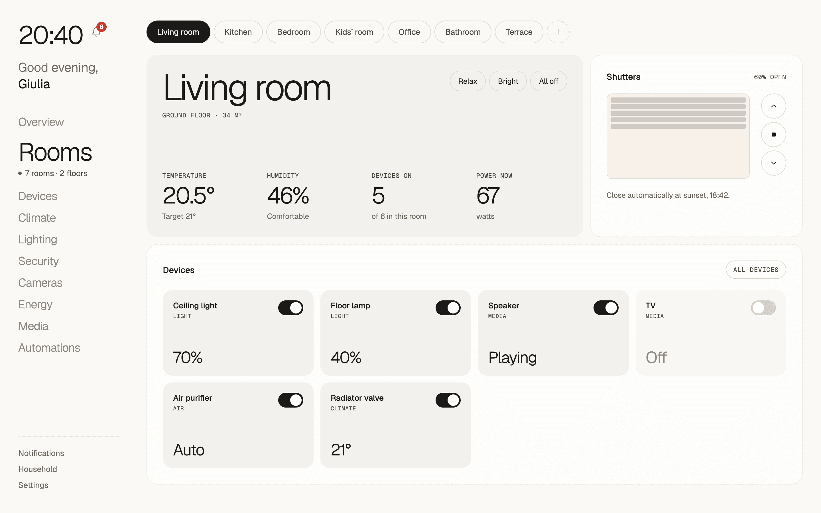
RoomsClimate, devices, and power for one room. 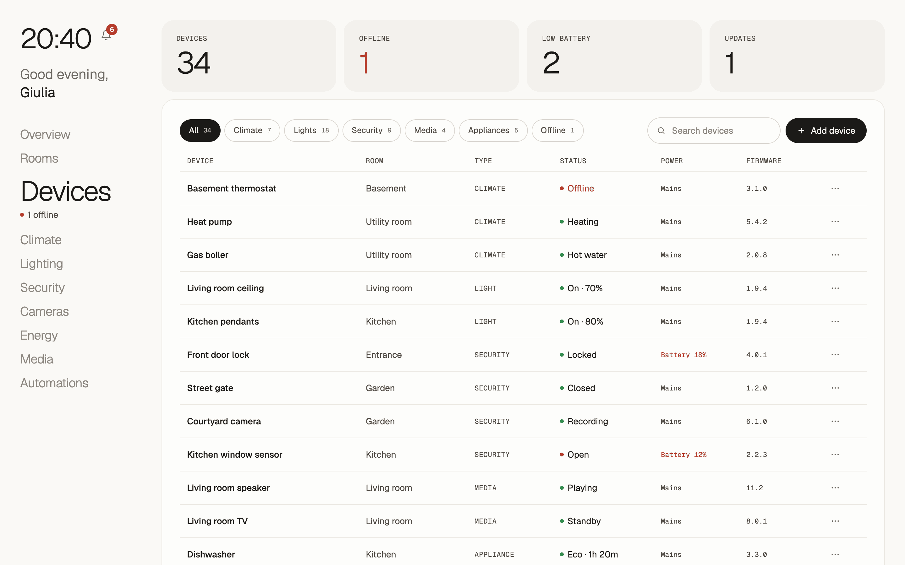
DevicesEvery device, with what needs attention. 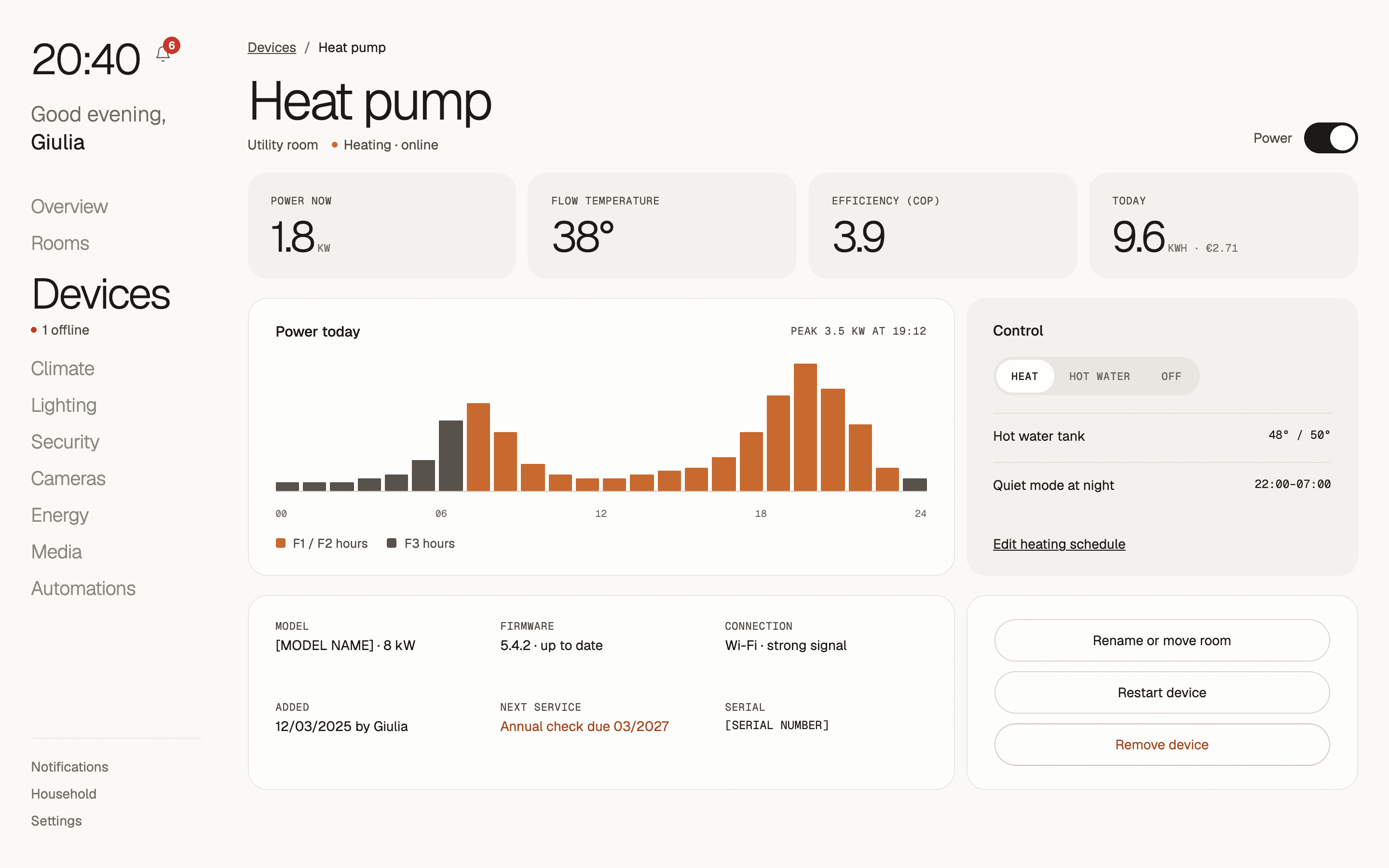
Device detailLive power, efficiency, and cost. 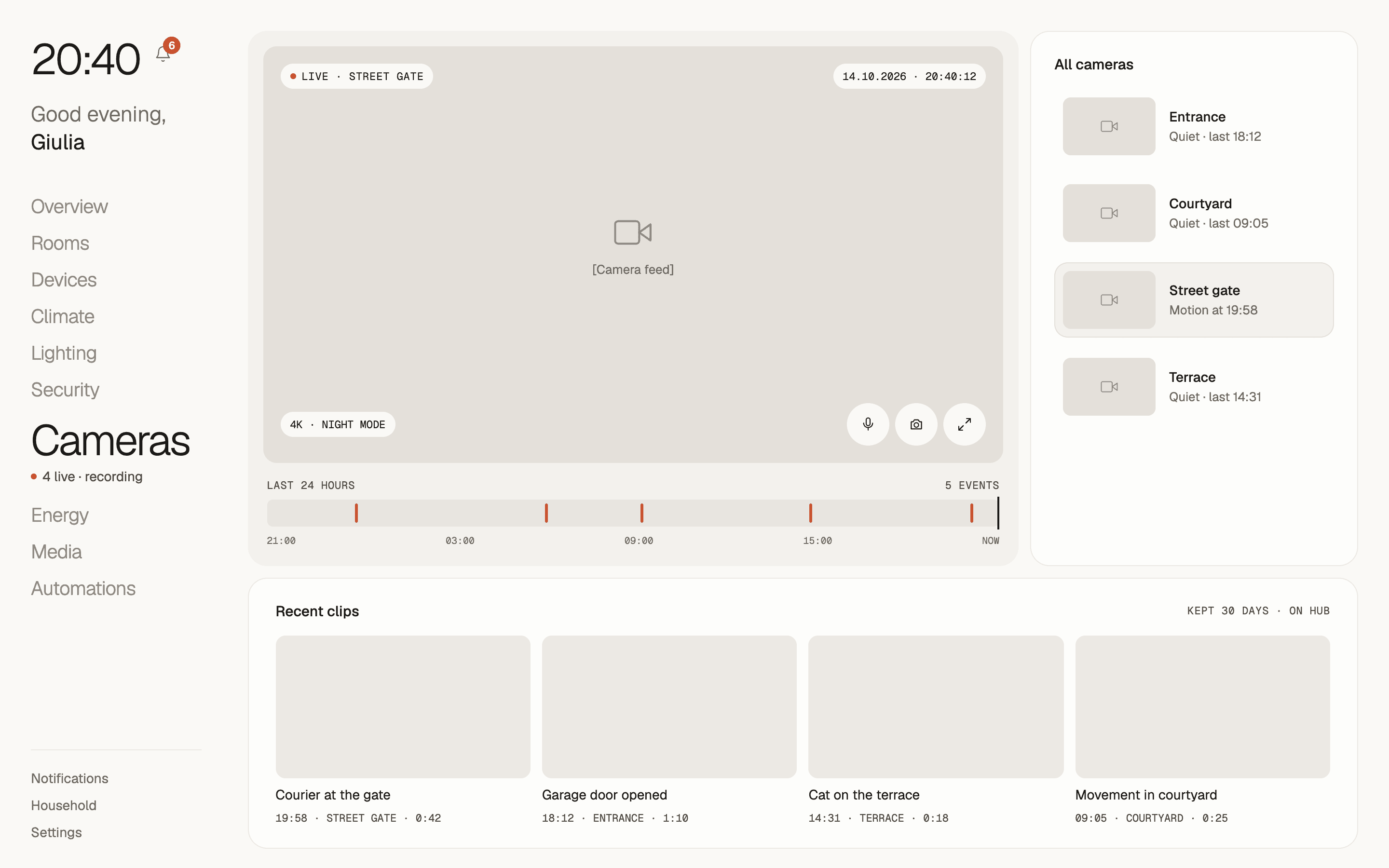
CamerasLive feed, a day of events, and clips. 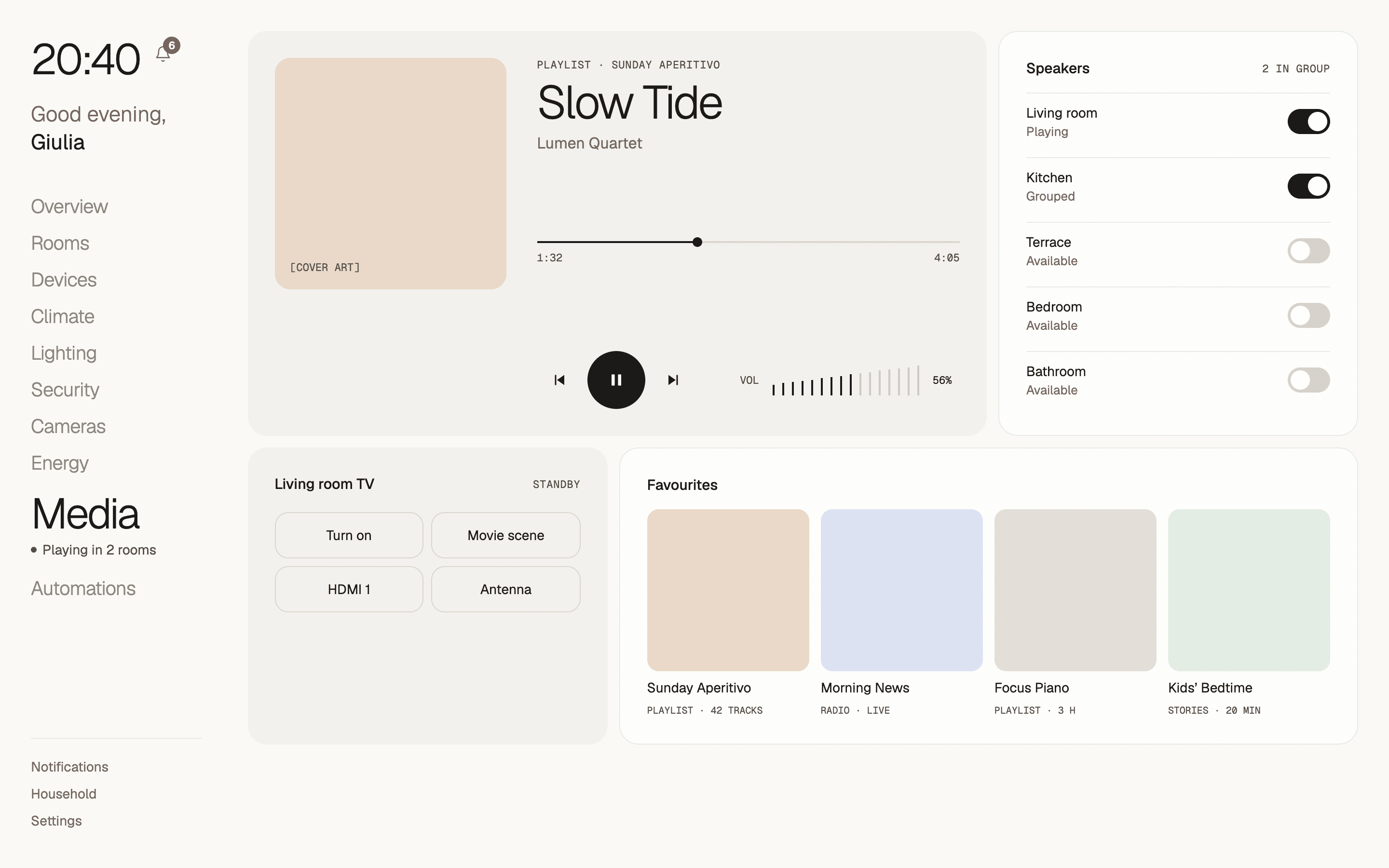
MediaSpeakers grouped across rooms, and the TV. 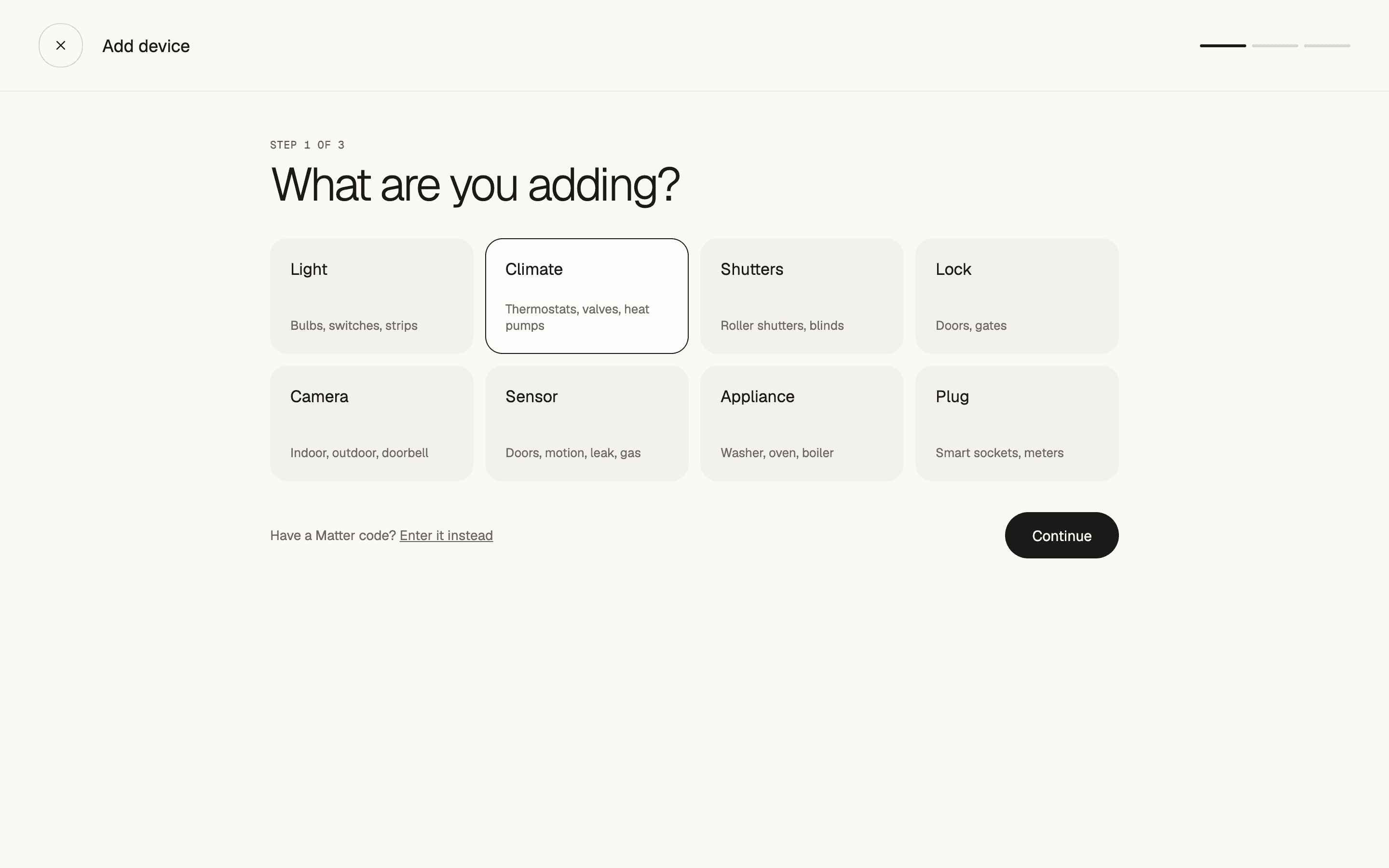
Add deviceStart from what it is, or a Matter code.
Automations, household, and settings
The problemPeople avoid automations when they can't see what runs and when.
What we did
- Each automation shows its trigger, like a time, sunset, the last person leaving, the cheapest tariff band, or extra solar, and turns off with one switch.
- Notifications can be filtered by alerts, security, energy, and system, and each one links to its next step, like watching the clip.
- Household sets access for each person and creates guest codes for visitors.
- The account adds two-step verification and a separate PIN for the alarm and locks.
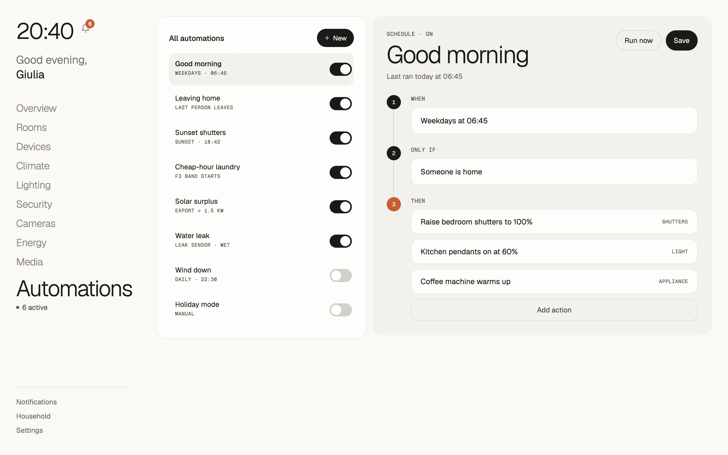
AutomationsTriggers, schedules, and a switch for each. 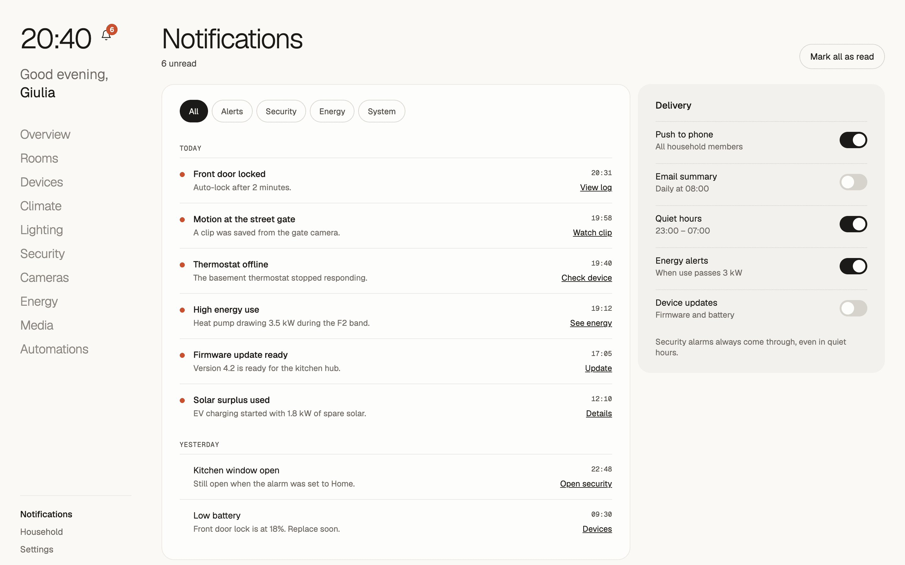
NotificationsFiltered by type, each with a next step. 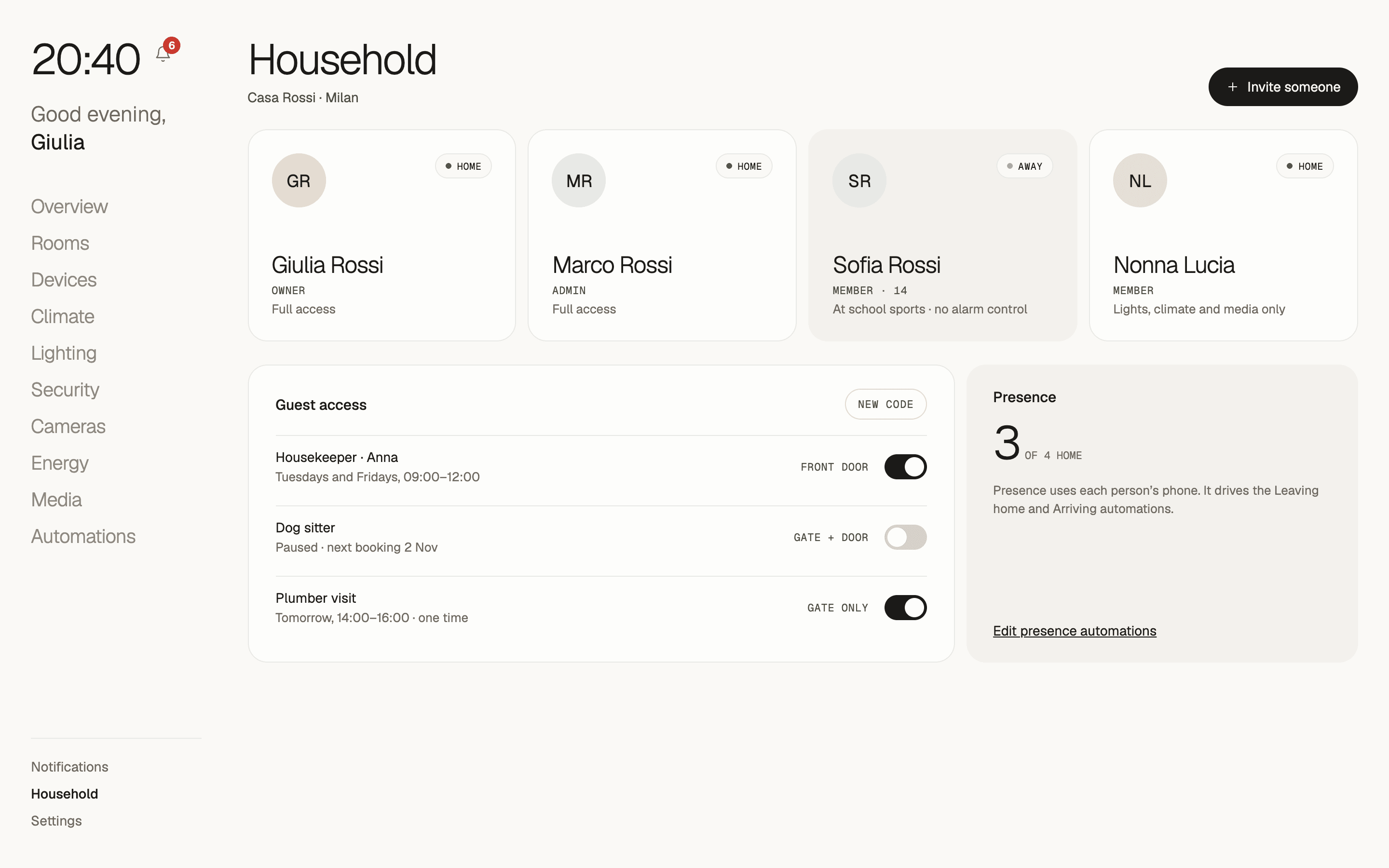
HouseholdAccess per person, and guest codes. 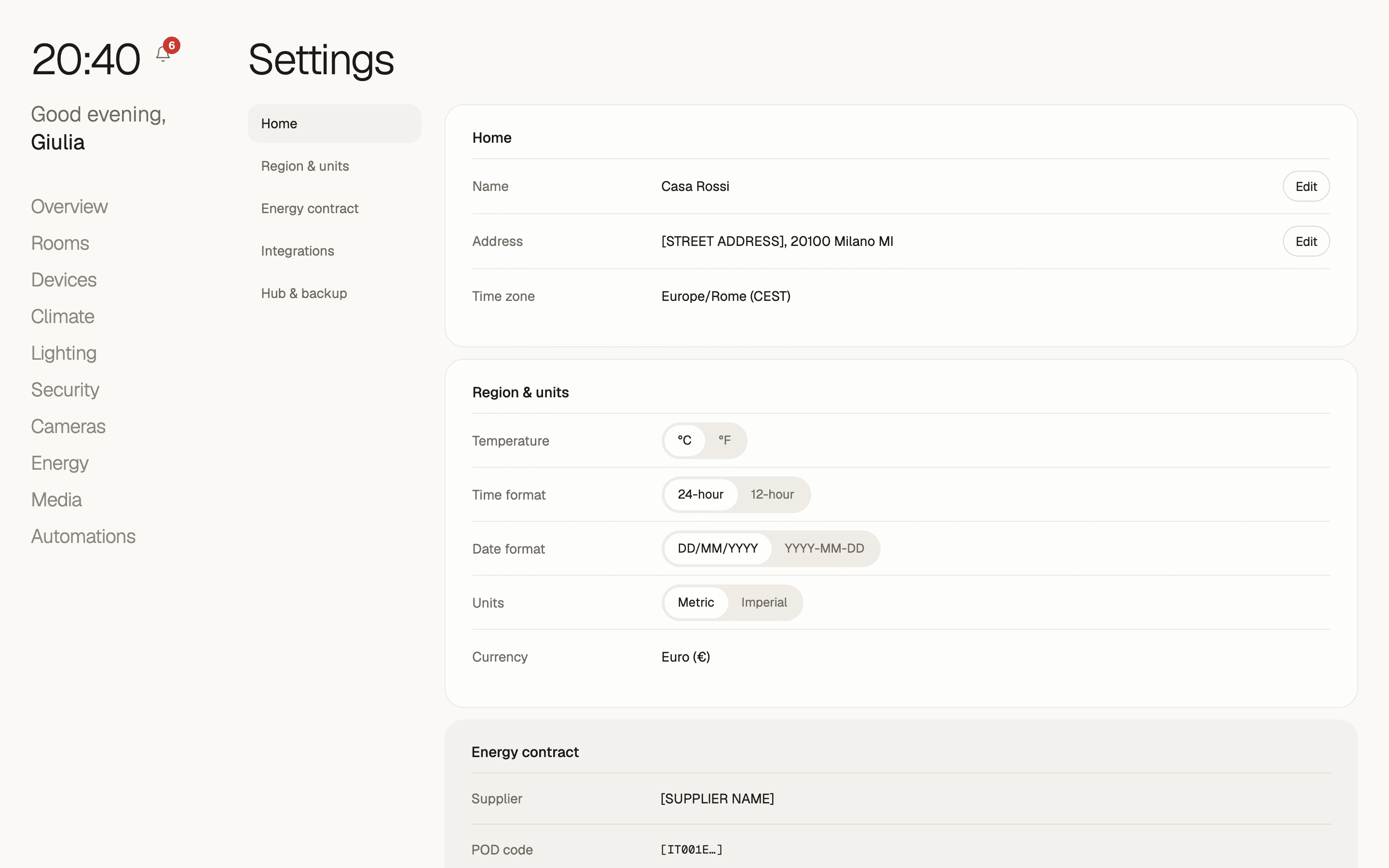
SettingsHome, units, energy contract, and hub. 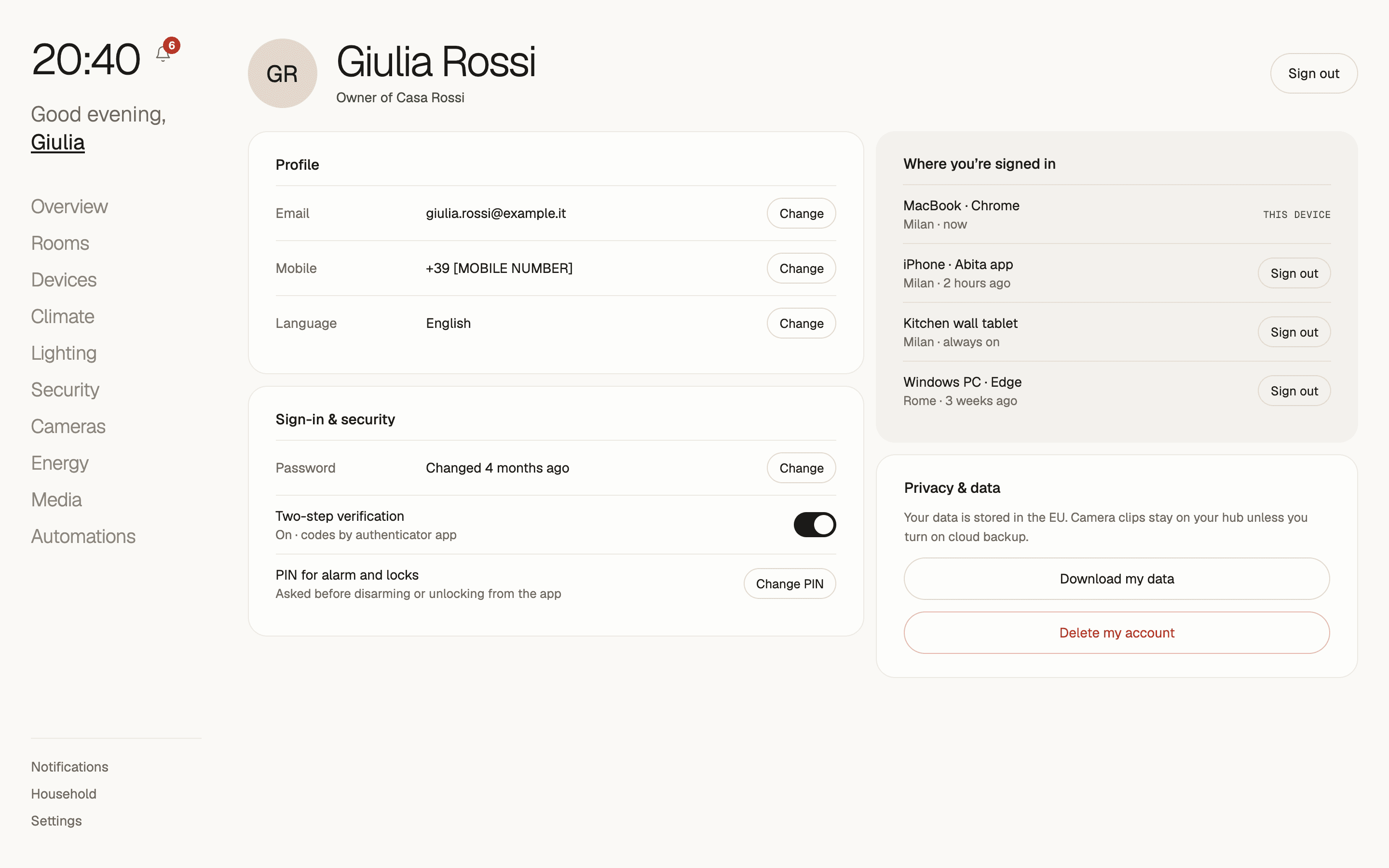
AccountProfile, security, and privacy.
The visual system
Warm neutrals and one terracotta accent. We wanted the dashboard to look like part of the house.
- Ink#1B1A18Type and primary actions
- Stone#6E6961Supporting text
- Paper#FAF9F6Page background
- Sand#ECE9E3Panels and controls
- Terracotta#C8692FAccent, heating, and energy charts
- Alert#C9372CAlerts and offline devices
- Big readings, small labels
- Readings like 21° or 212 kWh are set large, with small monospaced labels above them.
- One accent
- Terracotta marks what's active or costs money. Red is only for alerts.
- A fixed frame
- The sidebar and the greeting with the time stay in place as you move between areas.
- Built to be used
- Icon-only buttons have labels for screen readers, and controls use real buttons, switches, and inputs.
How success is measured
The numbers that show whether the design fixes the problem.
- How many households finish setup in one sitting
- How many alerts get acted on within an hour
- Change in energy cost once cheap-hour automations are on
- How many people besides the owner use the app each week
Next case study: Core. A tracker for people who log food, workouts, and habits in three different apps and still can't tell if the day went well.
Planning an app like this? Send a few lines about it, see how a project runs week by week, or browse all our work.
Have something worth building?
- Product strategy
- iOS
- Design systems
- Launch sites
- Measurement
- Android
- Prototypes
- UX design
- MVPs
- Web apps
- UI design
Send a few lines about it. You will get an honest reply within two days, and a plan if it fits.