Case study · CorePublished
Turning three tracking apps into one daily score
People who take their health seriously often use one app for food, another for workouts, and a third for habits. None of them can say whether today went well. Core puts all three in one place and turns them into a single daily score, with a coach that explains it and logging quick enough to keep up with.
- iOS app
- Health & fitness
- Product design
- UX & UI
- Clickable prototype
- Design system
At a glance
- Platform
- iOS, iPhone
- Who it's for
- People tracking food, training, and habits
- Our role
- Product design, UX, UI, prototype
- Year
- 2026
The problem
Most trackers do one job well. People who want to eat better and train more end up switching between apps, and the numbers never add up to an answer. We started from the question they actually ask at the end of the day: did today go well, and what should I change?
- 01
Three apps for one goal
Food, workouts, and habits live in separate apps. None of them sees the whole day, and none can tell you how it went.
- 02
Logging takes too long
Searching for every ingredient and guessing portions adds minutes to each meal. Slow logging is the first habit people drop.
- 03
Numbers with no meaning
Calories, macros, and steps arrive as separate figures. People see the data and still don't know what to do differently.
- 04
Targets that don't fit
Generic calorie targets ignore the person's goal, activity, diet, and allergies. The plan feels wrong on day one.
How we approached it
- 01
One score for the whole day
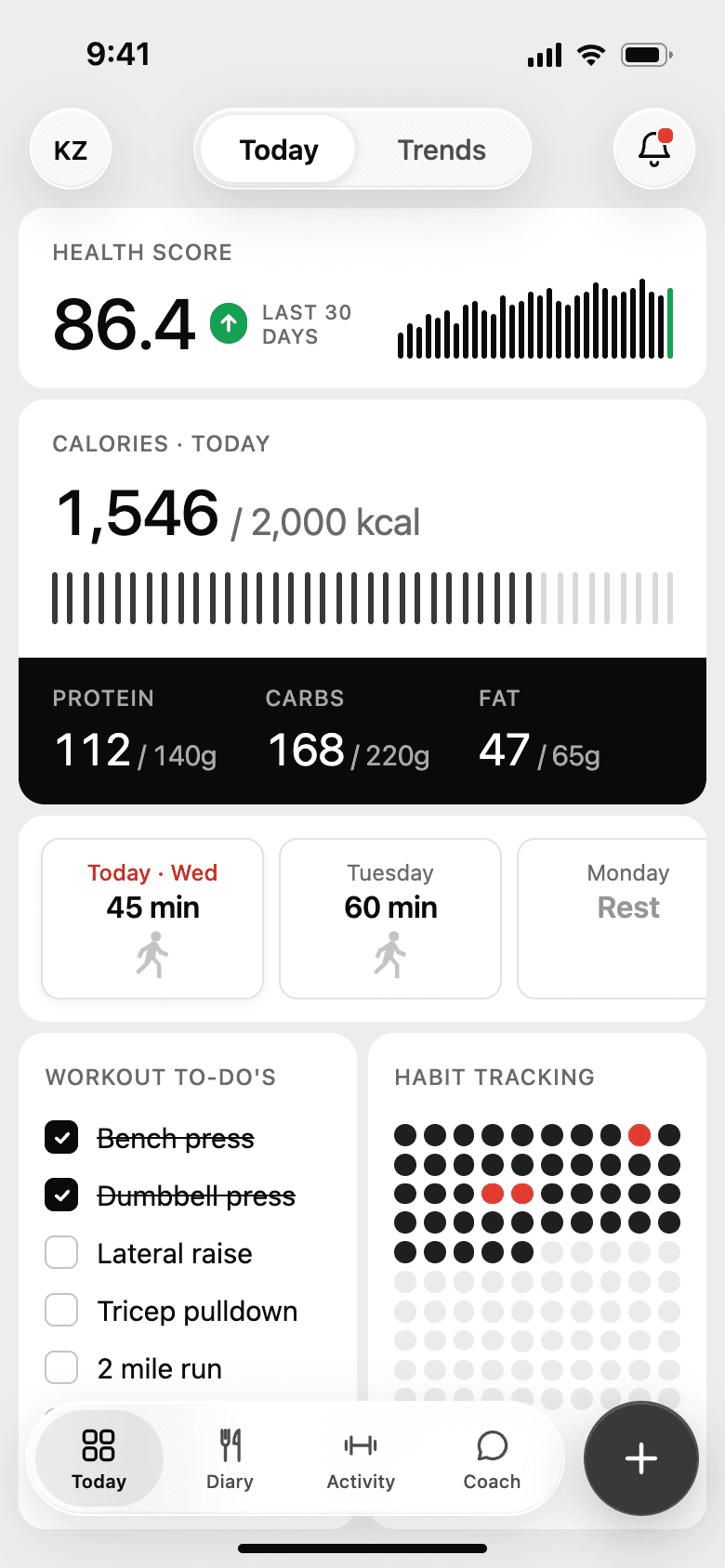
We rolled food, activity, workouts, and habits into one health score at the top of the Today screen. The detail sits one tap below it.
- 03
A coach that knows the numbers
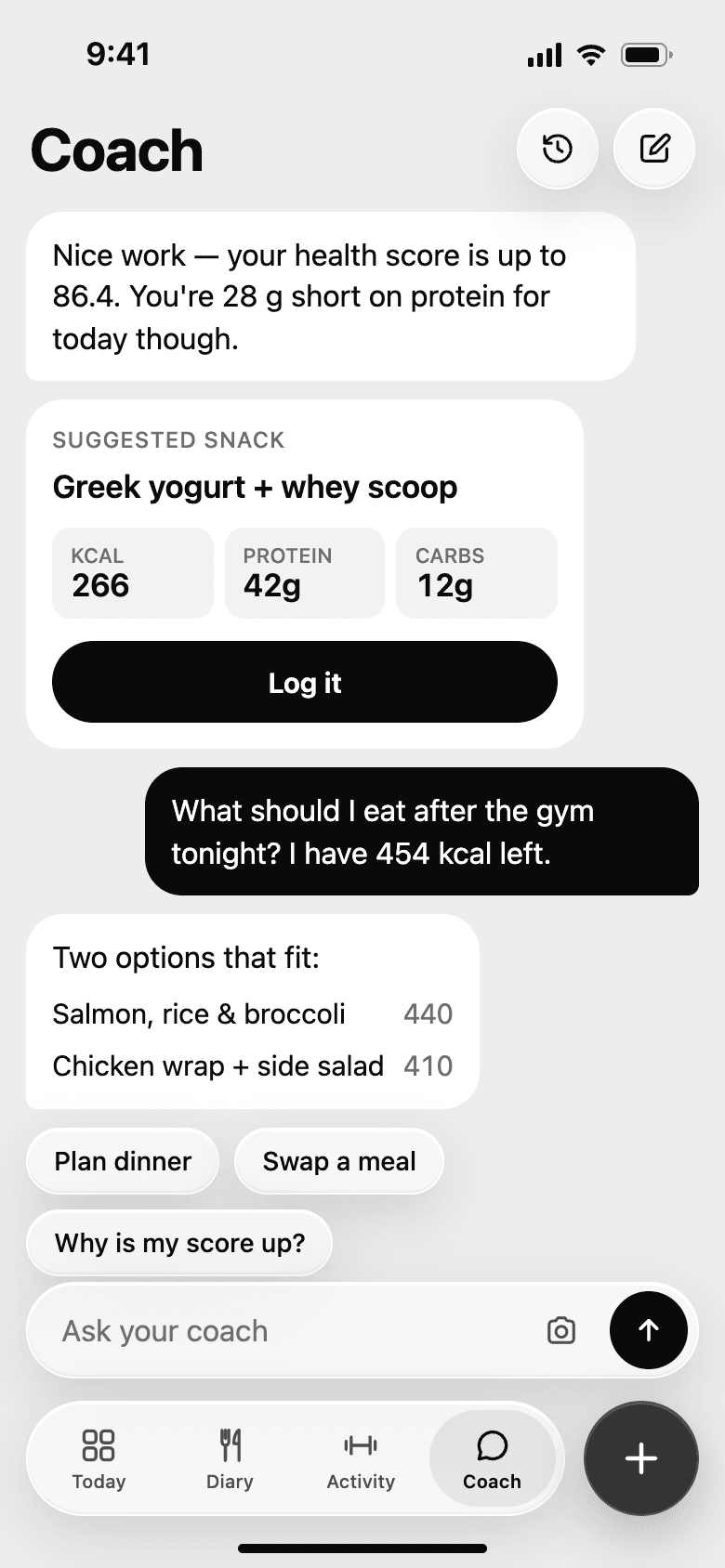
Coach answers with the person's own data, like the protein they're still short of or the calories left for dinner.
- 04
A plan before the first log
Onboarding asks five short questions and comes back with calories, macros, a weekly pace, and a goal date.
Onboarding
The problemGeneric targets feel wrong from the start, and people won't share personal details without knowing why they're being asked.
What we did
- Every question says what it's for. Age and height are only used to estimate energy needs, and the screen says so.
- The plan comes back as a number and a date, 2,000 kcal a day and 75 kg by mid-December. People can tell right away whether it seems realistic.
- Allergies set here are used later. Scan a bar with peanuts in it and the app warns you before you add it.
- Permissions come last, one at a time, each with a limit attached. No more than three notifications a day, and meal photos stay on the phone.
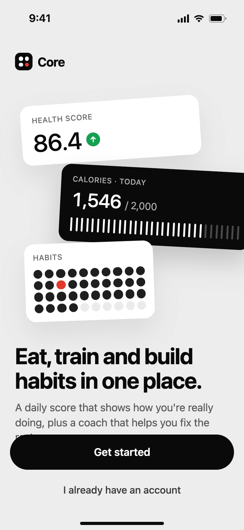
WelcomeThe product in one screen: score, calories, habits. 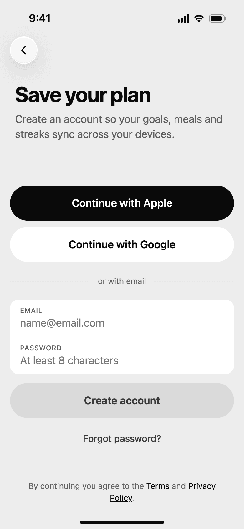
Sign inApple, Google, or email, so goals and streaks sync. 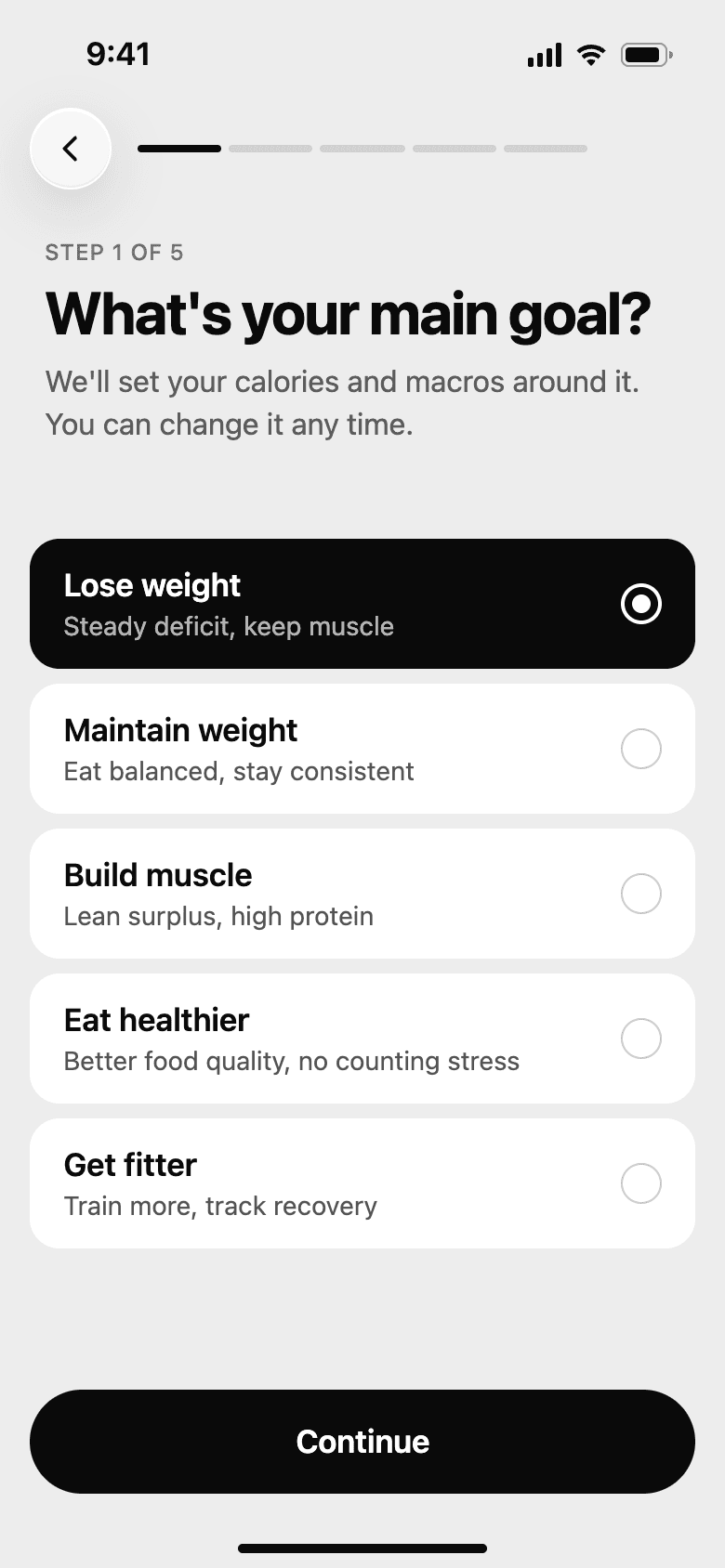
GoalFive goals, each with what it means for the plan. 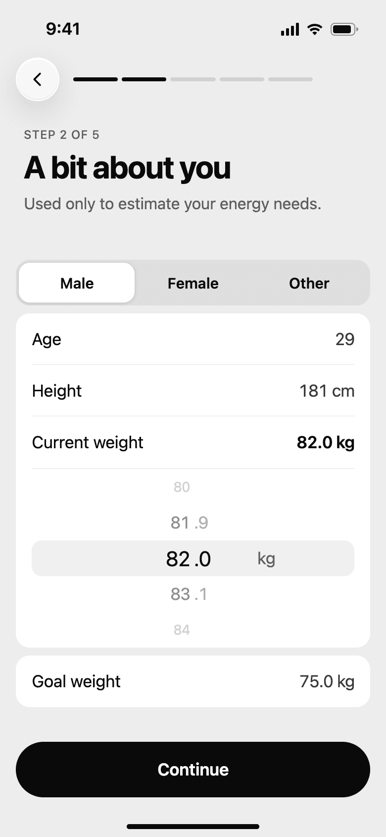
About youSays why it asks: only to estimate energy needs. 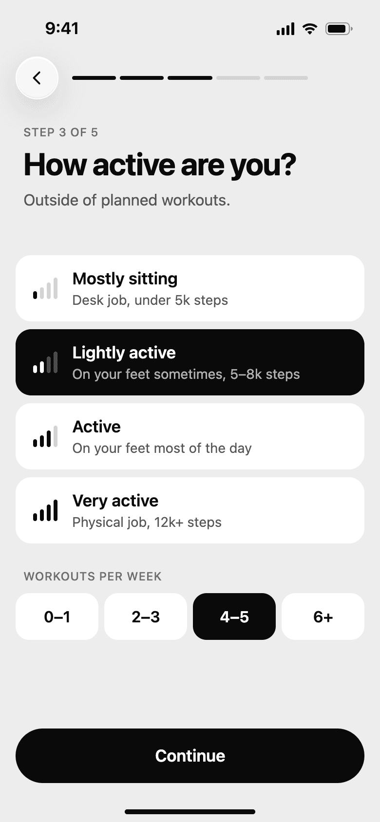
Activity levelEveryday movement and planned workouts, asked separately. 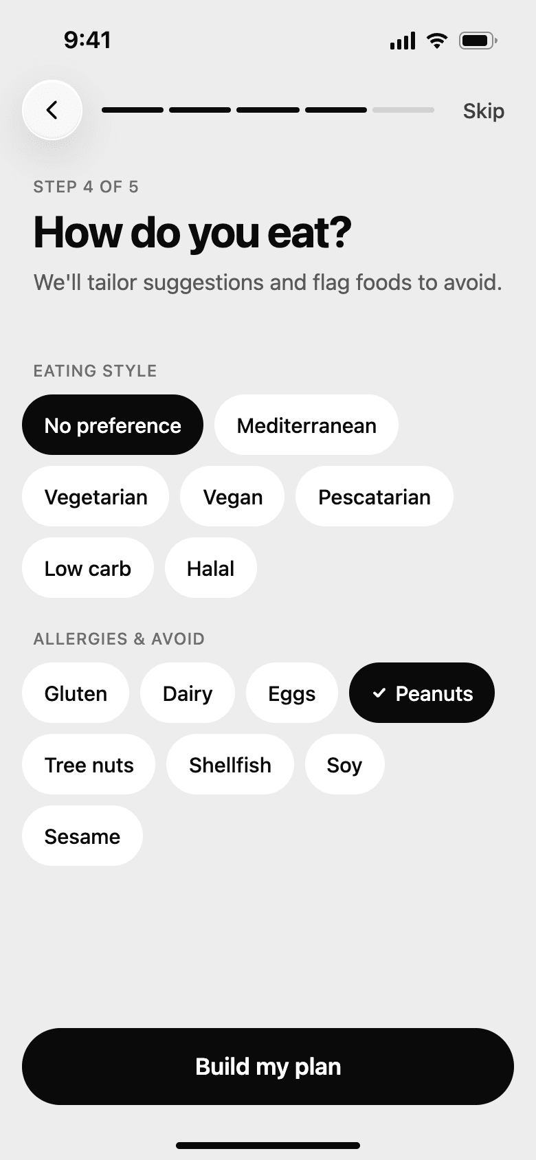
Diet and allergiesEating style, and the foods to flag later. 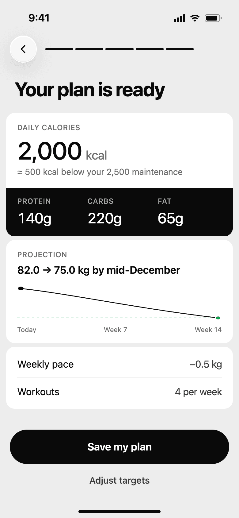
Your planCalories, macros, pace, and a goal date before saving. 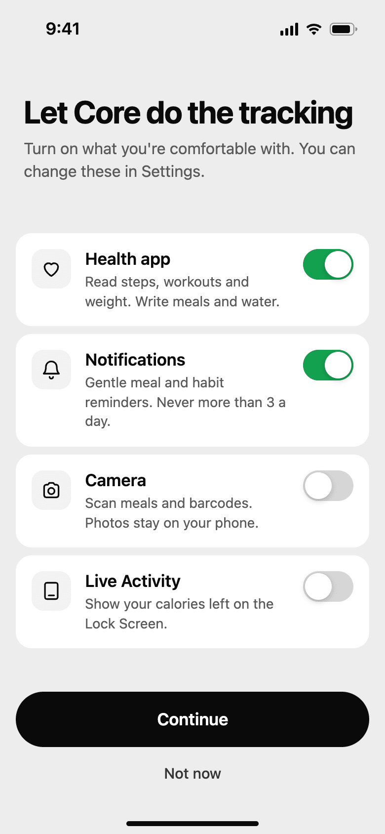
PermissionsEach one says what it does and what it won't.
Logging food
The problemIf logging a meal takes minutes, people stop doing it.
What we did
- The plus button is on every main screen. Logging never starts with hunting for the right tab.
- A photo of the plate is the fastest path. The scan names each item, estimates the portion, and shows how sure it is. A wrong guess gets fixed before anything is saved.
- Barcode scans check the avoid list from onboarding and warn before anything is added.
- Quick add takes a number when the calories are already known, and meals people eat often can be saved and logged in one tap.
- A week of planned meals turns into a grocery list, sorted into protein, produce, and pantry.
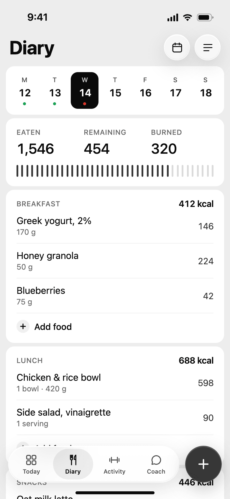
DiaryThe day by meal: eaten, remaining, burned. 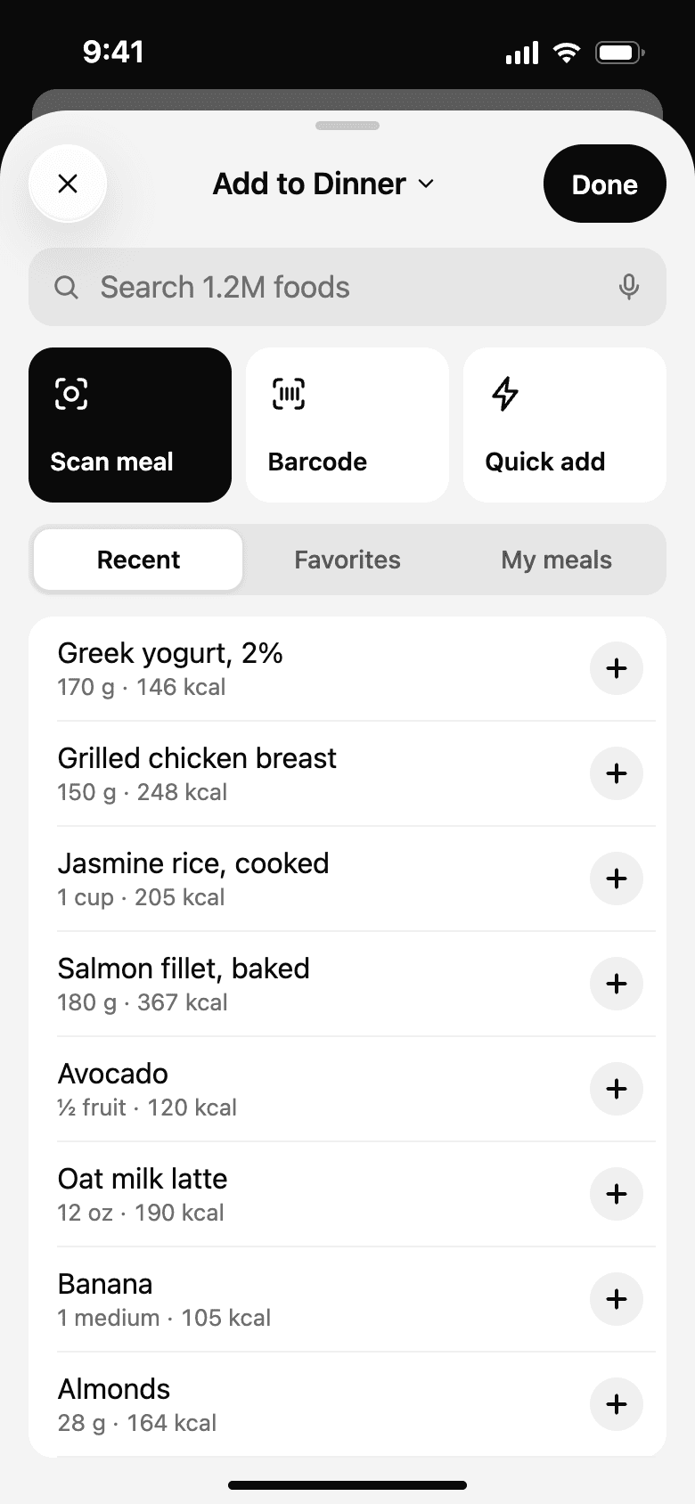
Log foodFour ways in, with recent foods one tap away. 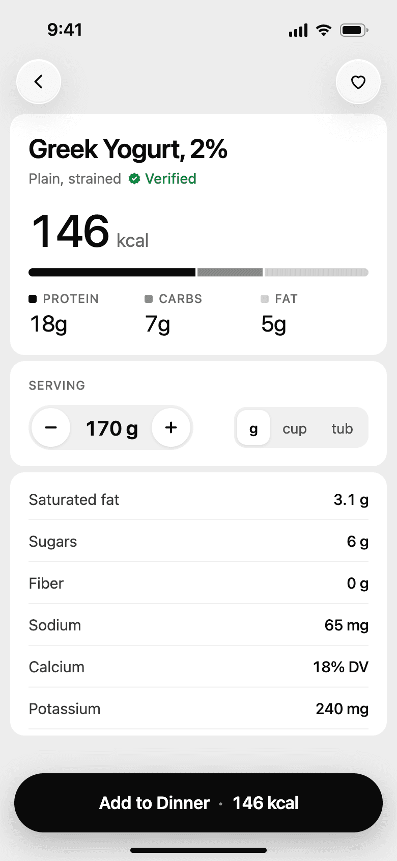
Food detailVerified entries, in grams, cups, or tubs. 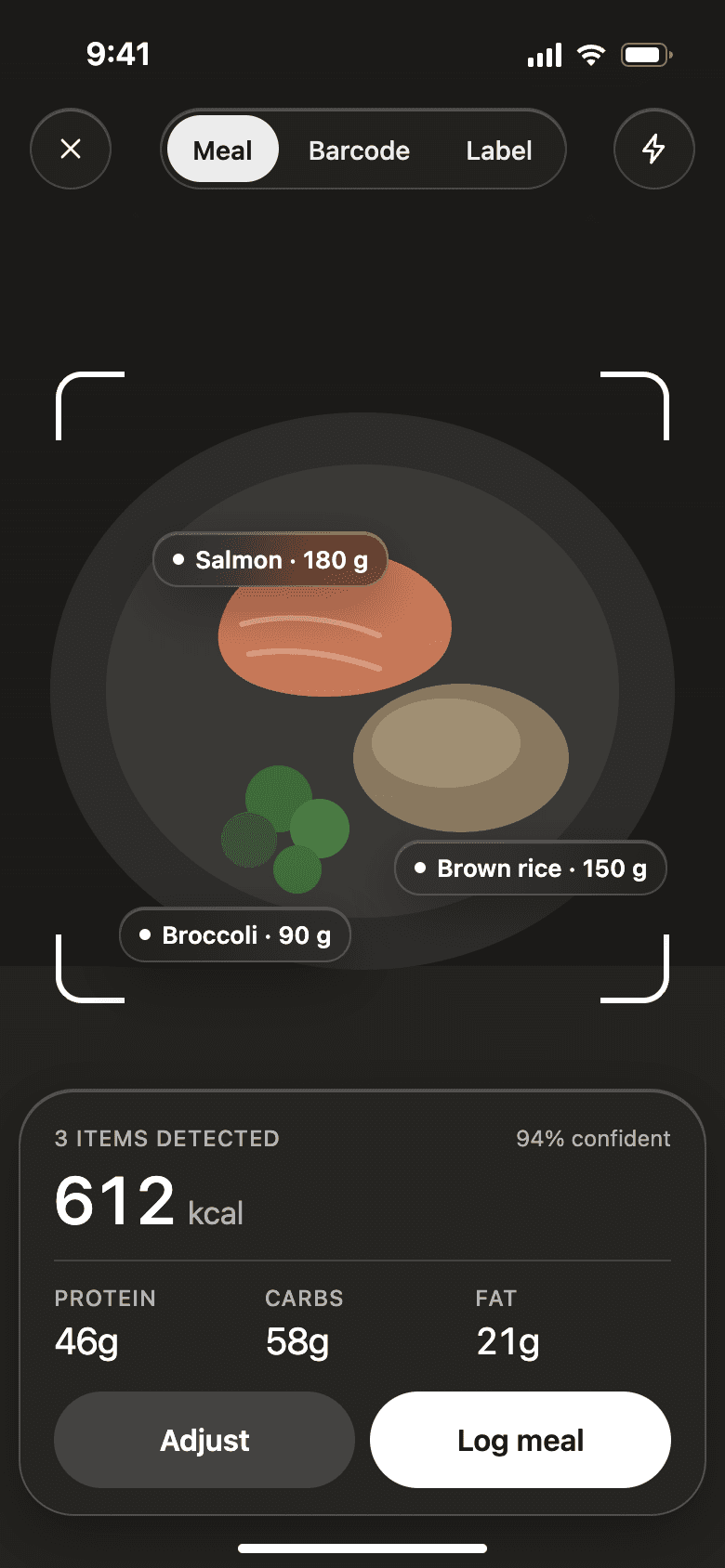
Scan mealItems, portions, and confidence from one photo. 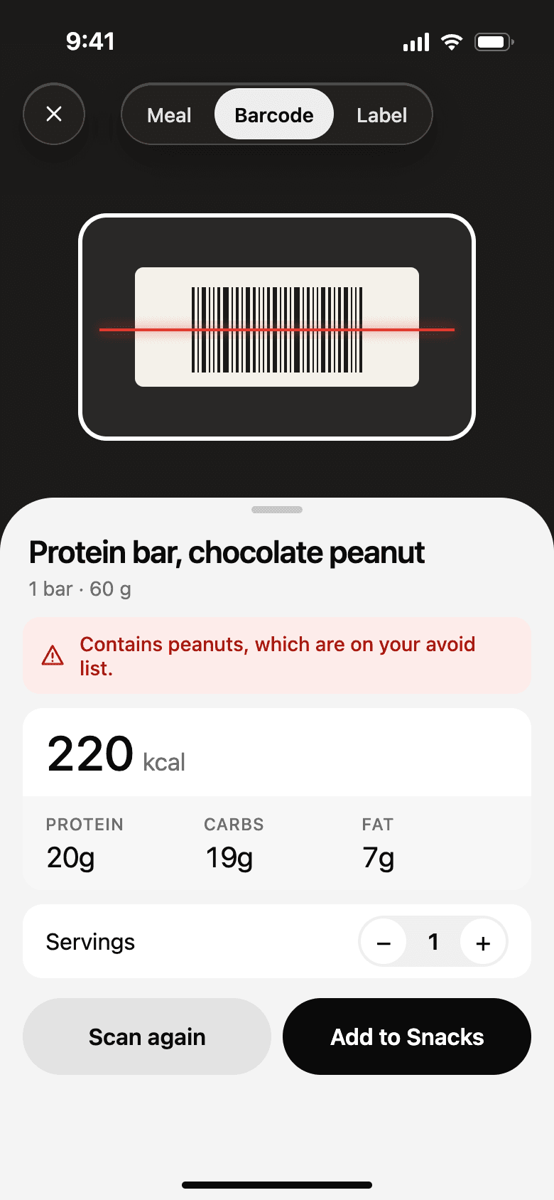
BarcodeWarns when a product is on the avoid list. 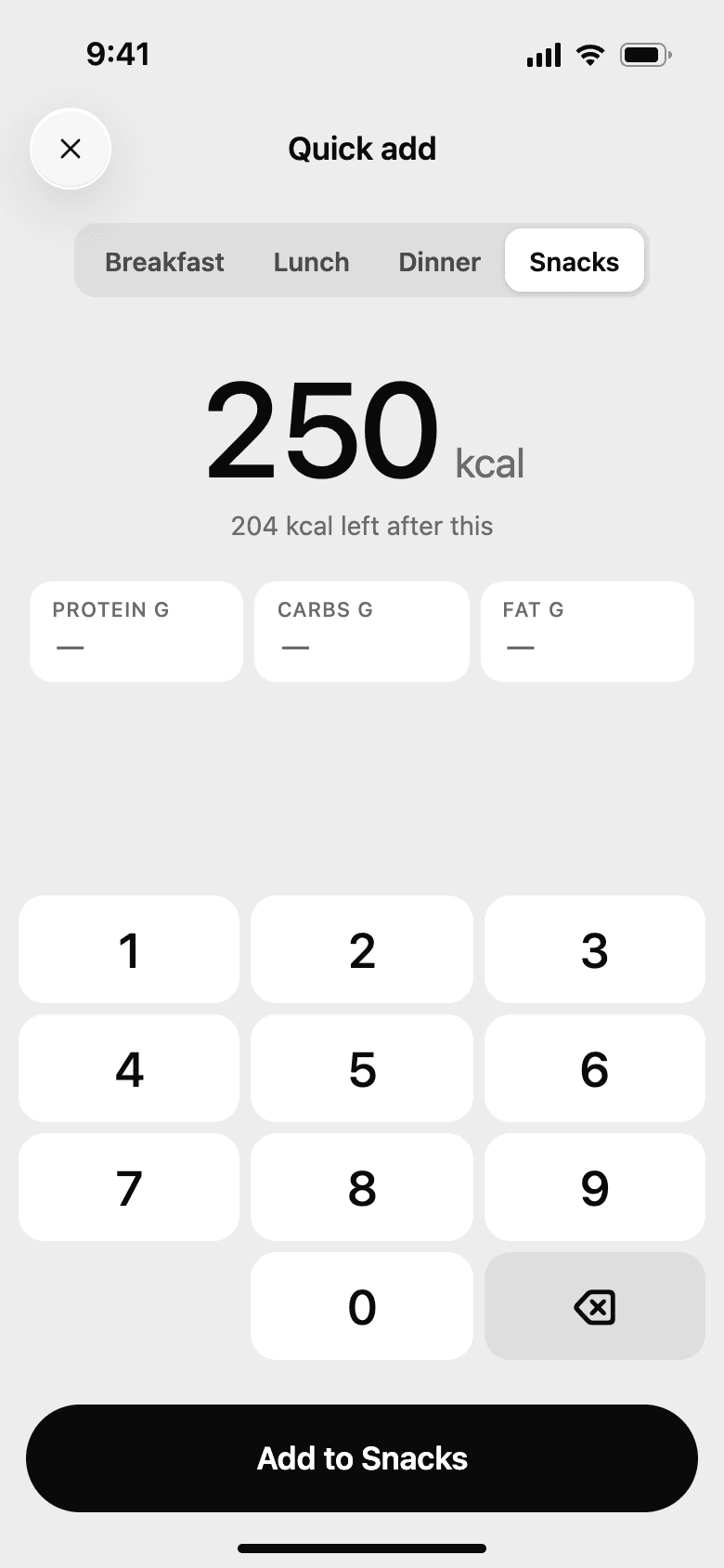
Quick addA number pad for when the calories are known. 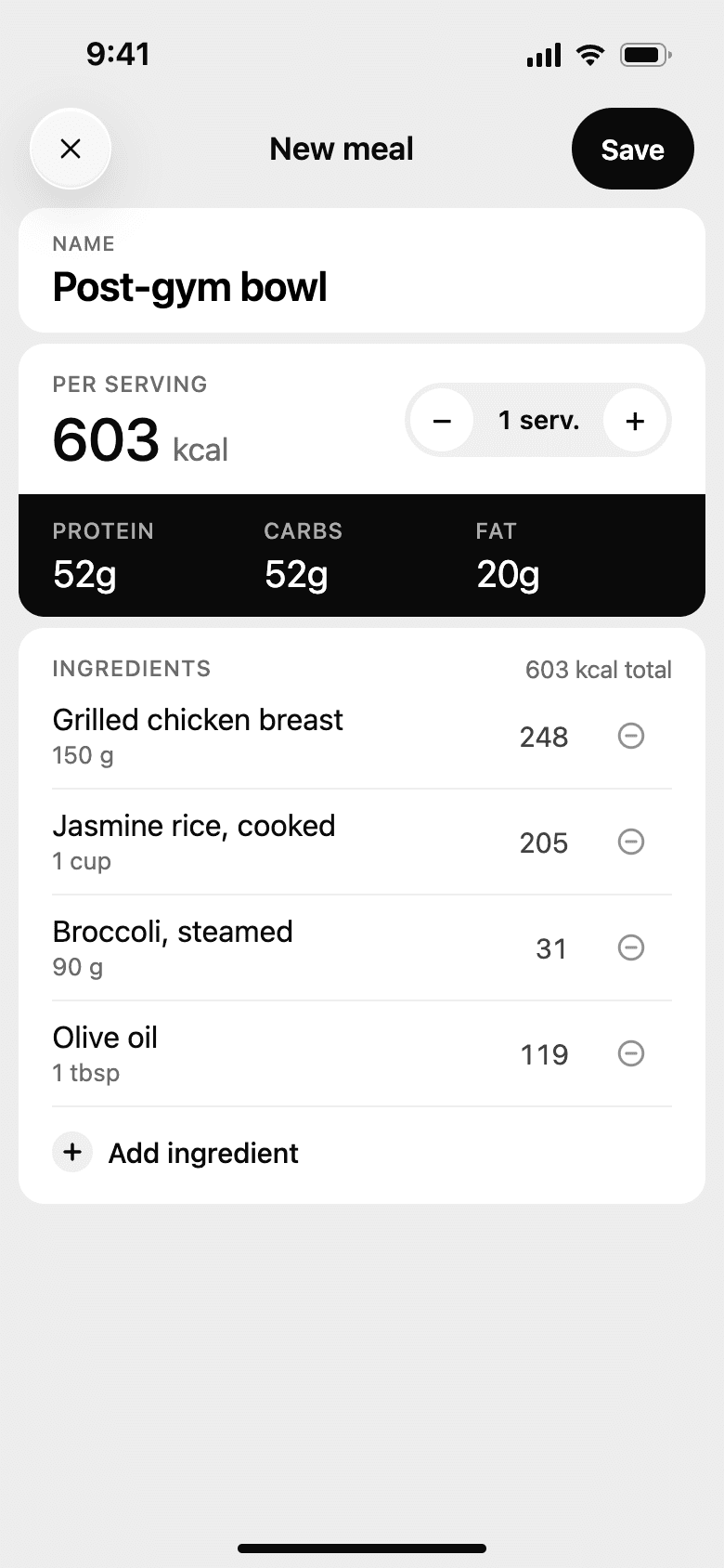
Create mealSave a recipe once, log it in one tap. 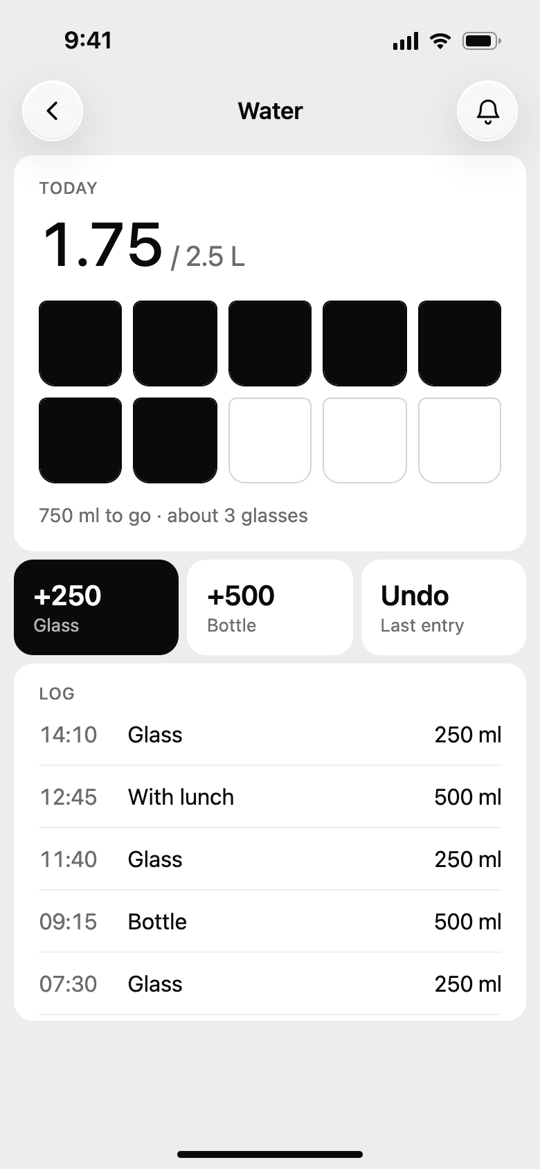
WaterA glass or a bottle in one tap, with undo. 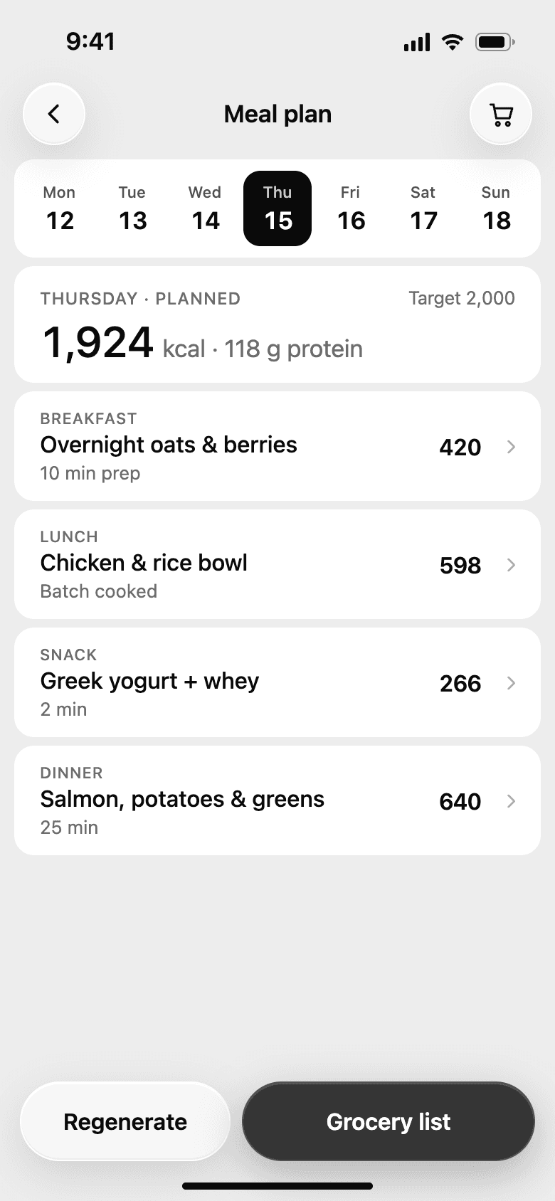
Meal planA week of meals that fits the target. 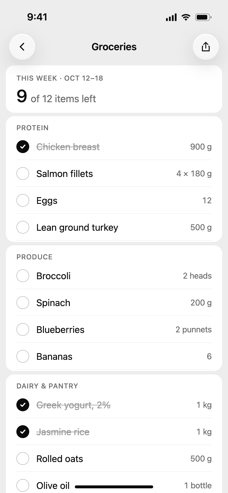
Grocery listBuilt from the plan, ticked off in the shop.
Training and habits
The problemWorkouts and habits usually live in separate apps, and the day's food plan has no idea about the evening's training.
What we did
- Workouts, habits, and meals feed the same score, and training days can raise the day's targets.
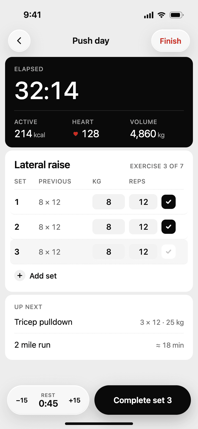
- The workout screen is made for use between sets: big numbers, last session's weights next to each set, and the rest timer near the thumb.
- After a session, the summary records any personal best and asks how hard it felt.
- Habits sit on a 100-day grid with one dot per day and red for a miss. You can see a streak without reading a single number.
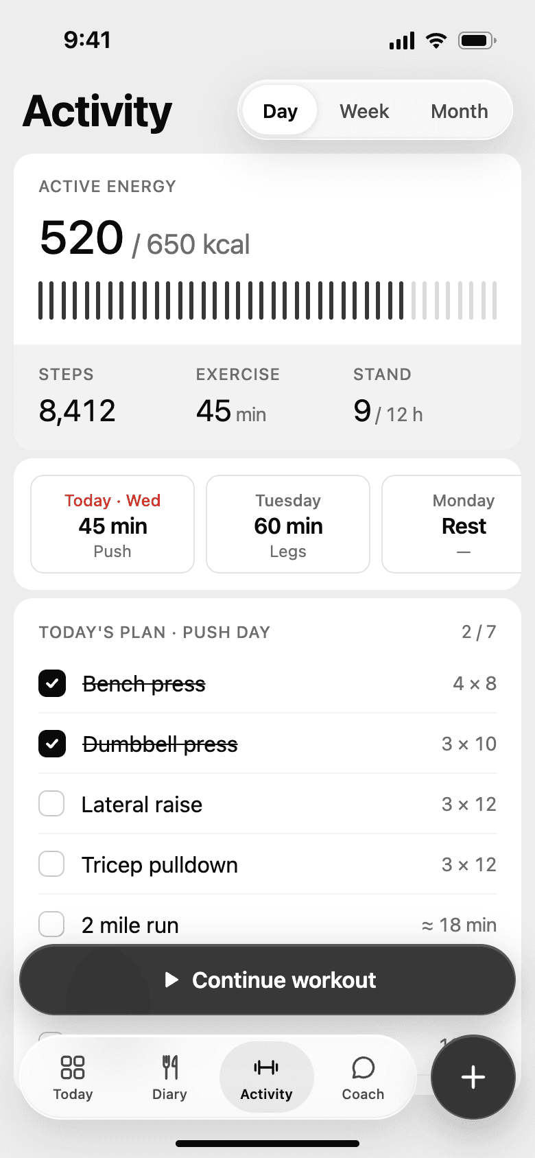
ActivityEnergy, steps, and today's training plan. WorkoutLast session inline, rest timer near the thumb. 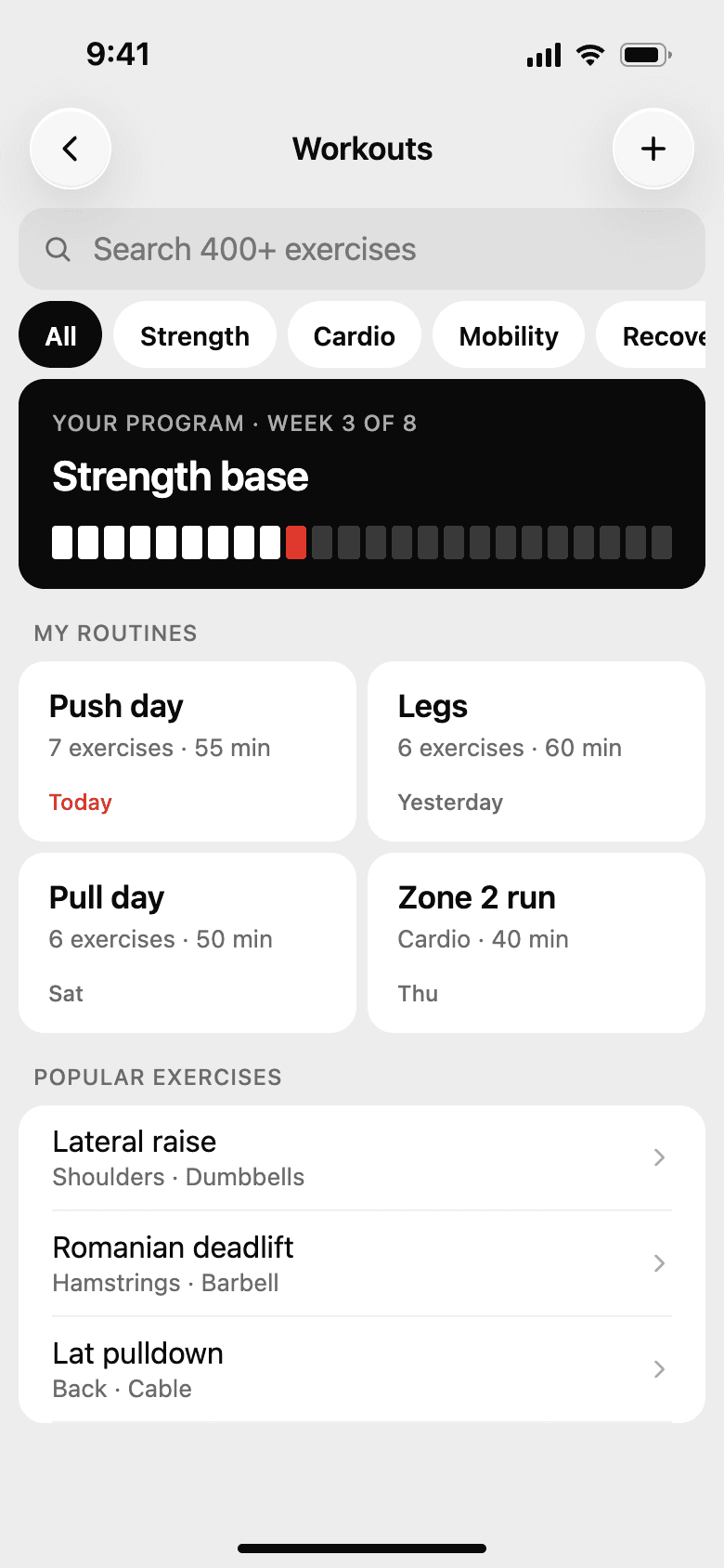
Workout libraryPrograms, routines, and 400+ exercises. 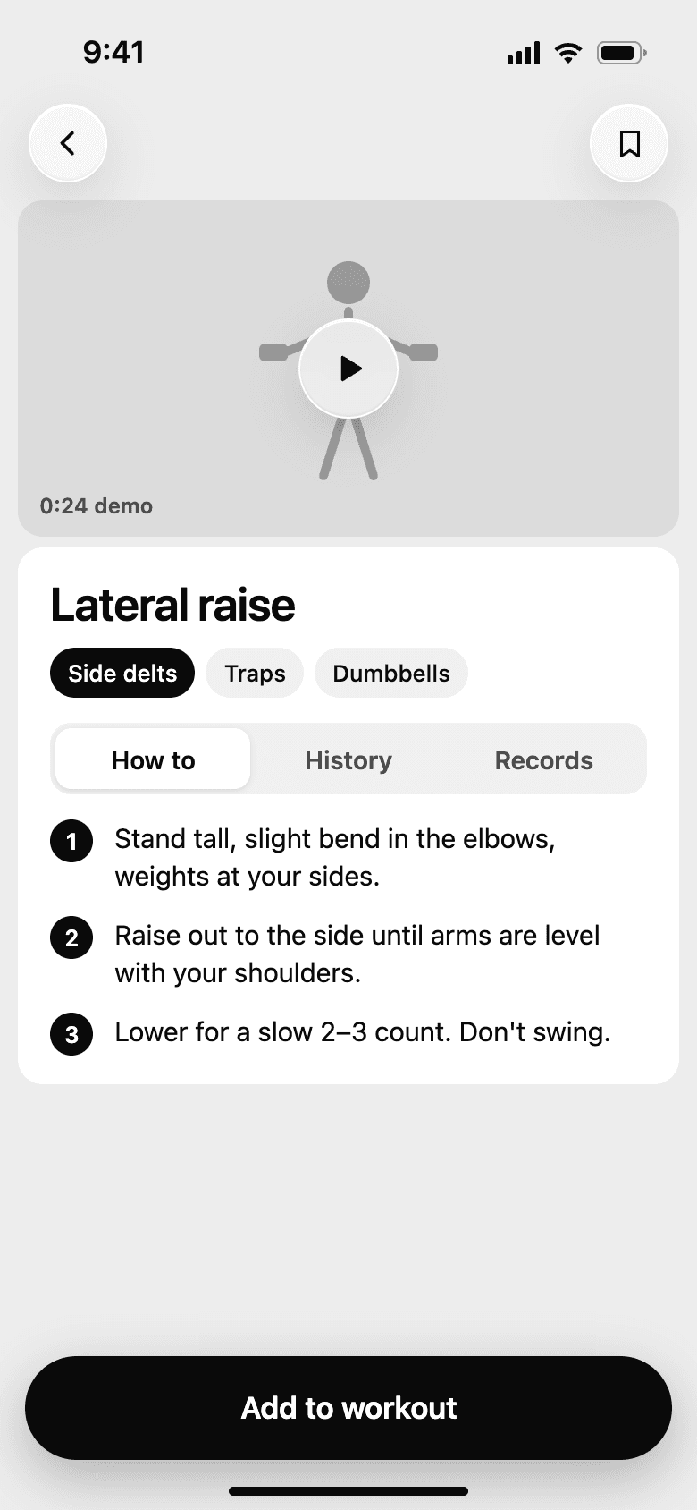
Exercise detailA demo, form cues, history, and records. 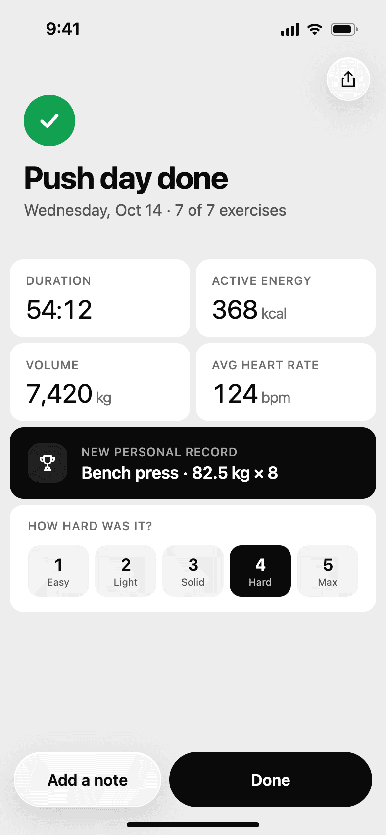
Workout summaryRecords the best, asks how hard it felt. 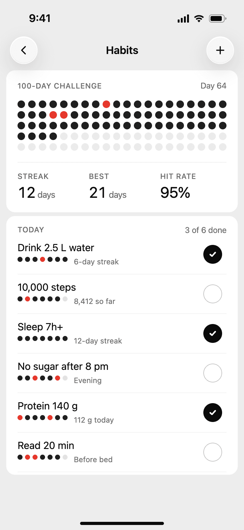
HabitsA 100-day grid, streaks, and today's list. 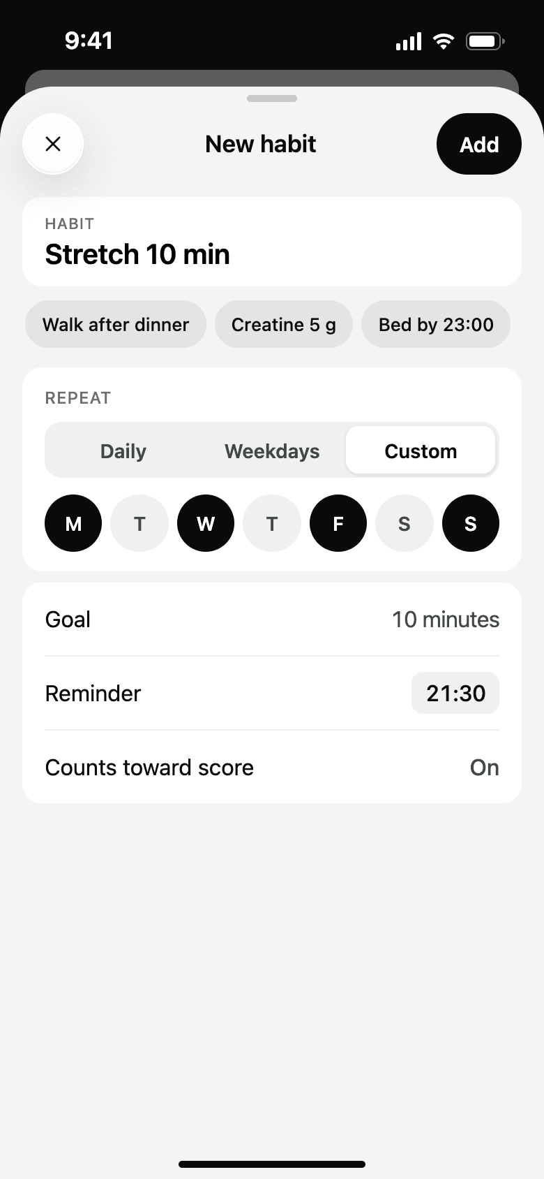
New habitSchedule, goal, reminder, and whether it counts.
Progress and coaching
The problemA dashboard full of numbers doesn't tell people what to do next.
What we did
- Coach works from the person's own data. Ask what to eat after the gym and it suggests meals that fit the calories left.
- The weekly report picks one win and one thing to work on, for example a Saturday that ran 380 kcal over.
- Notifications say what to do next, such as suggesting dinner when it hasn't been logged yet.
- Levels and badges reward showing up, like a 23-day logging streak, rather than perfect days.
TodayScore, calories, training, and habits on one screen. 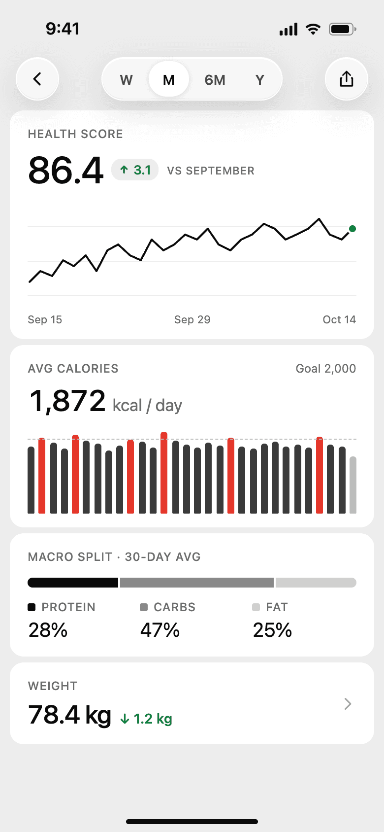
TrendsScore, calories, macros, and weight over time. 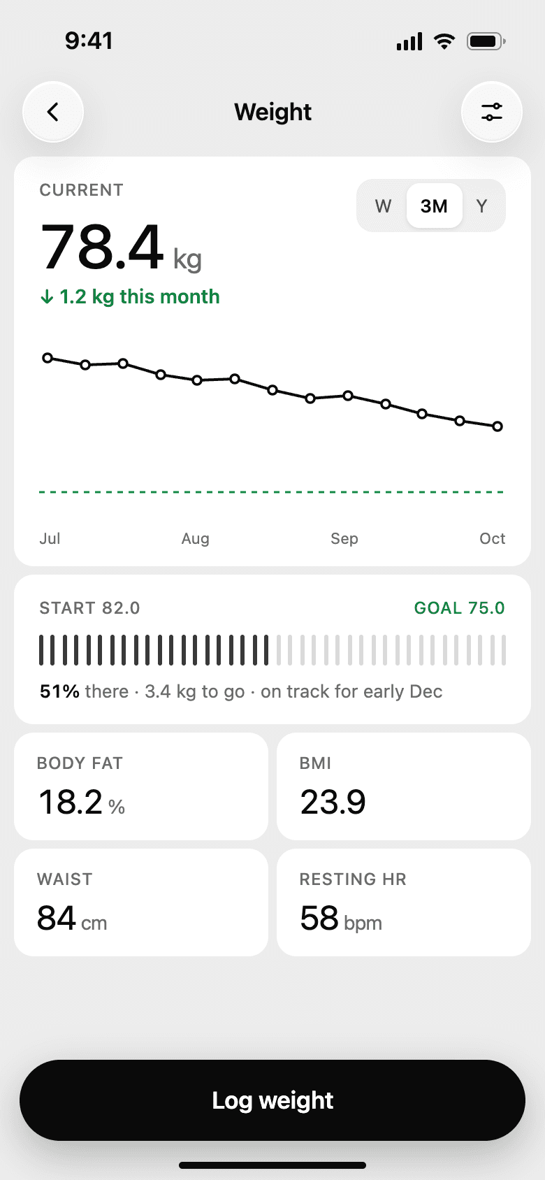
WeightThe trend against the goal, with a projected date. CoachAnswers from the person's own numbers. 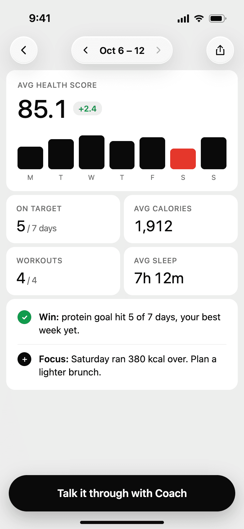
Weekly reportOne win, one thing to work on. 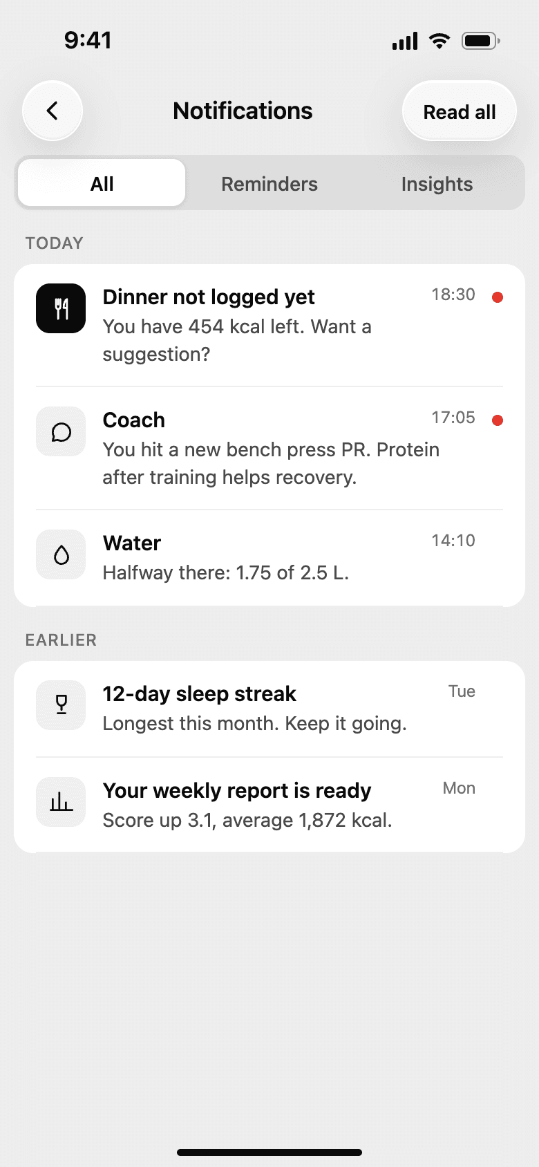
NotificationsEach one carries the next step. 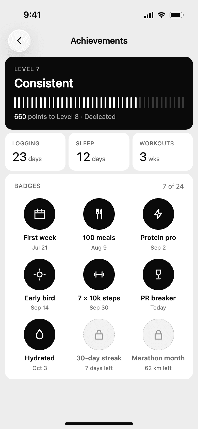
AchievementsLevels and badges for consistency. 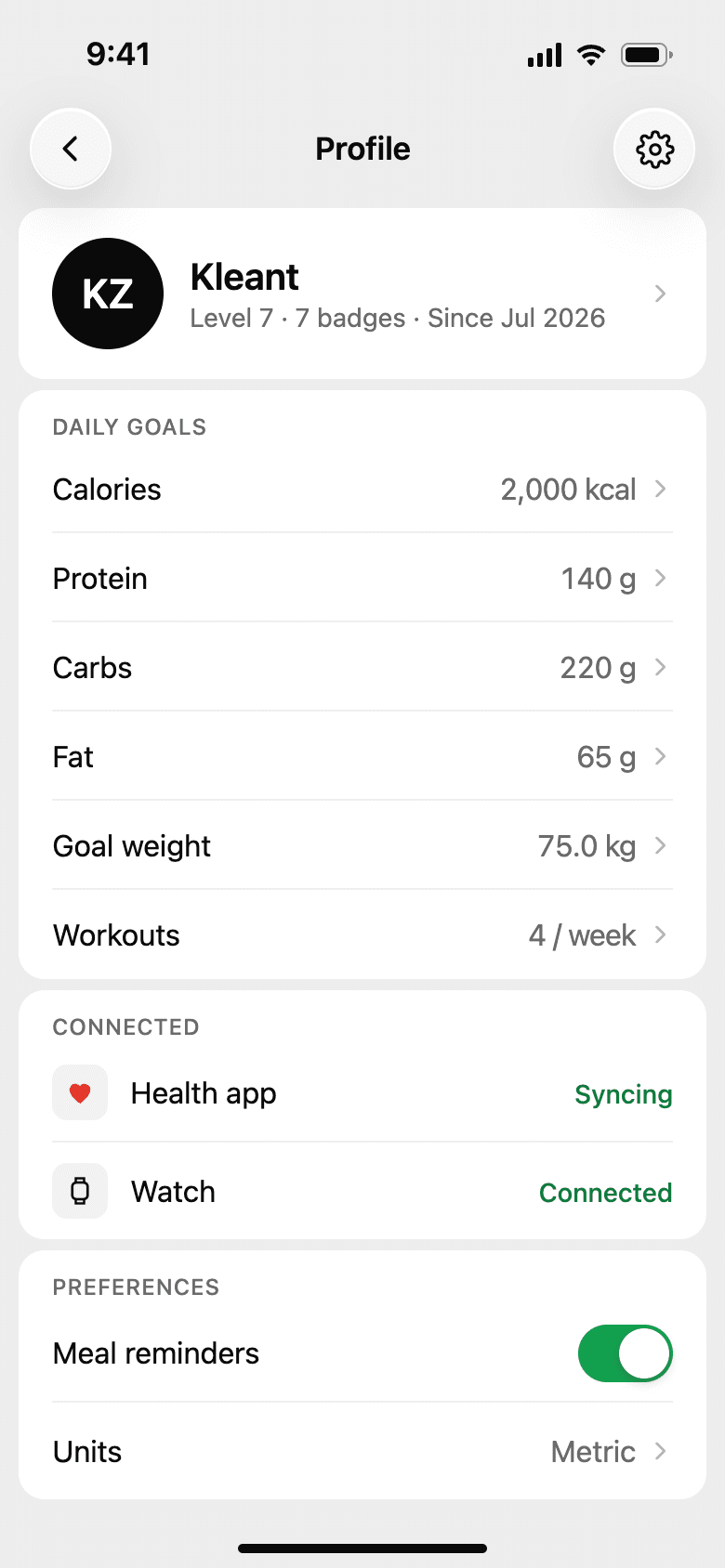
ProfileGoals, connected devices, and preferences.
Settings and trust
The problemReminders that ignore what's already logged get muted, and people hold back health data when they can't see where it goes.
What we did
- Smart timing skips a reminder if the meal is already logged, and quiet hours keep the nights free.
- Targets can follow training: 200 kcal more on training days, mostly from carbs.
- All data exports as CSV. Deleting the account says what is removed and when: everything, within 30 days.
- Core Pro is one screen listing what's included, the free trial, and how to cancel.
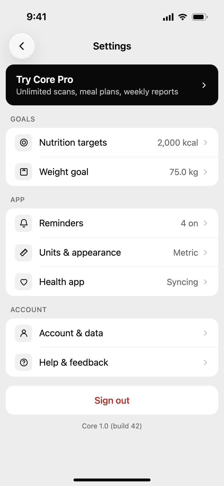
SettingsGoals, app, and account in three groups. 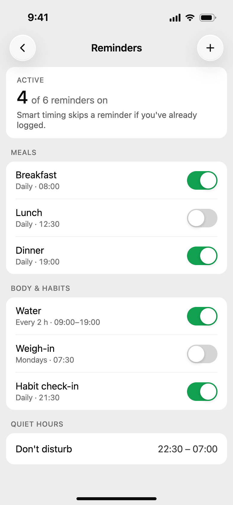
RemindersSmart timing and quiet hours. 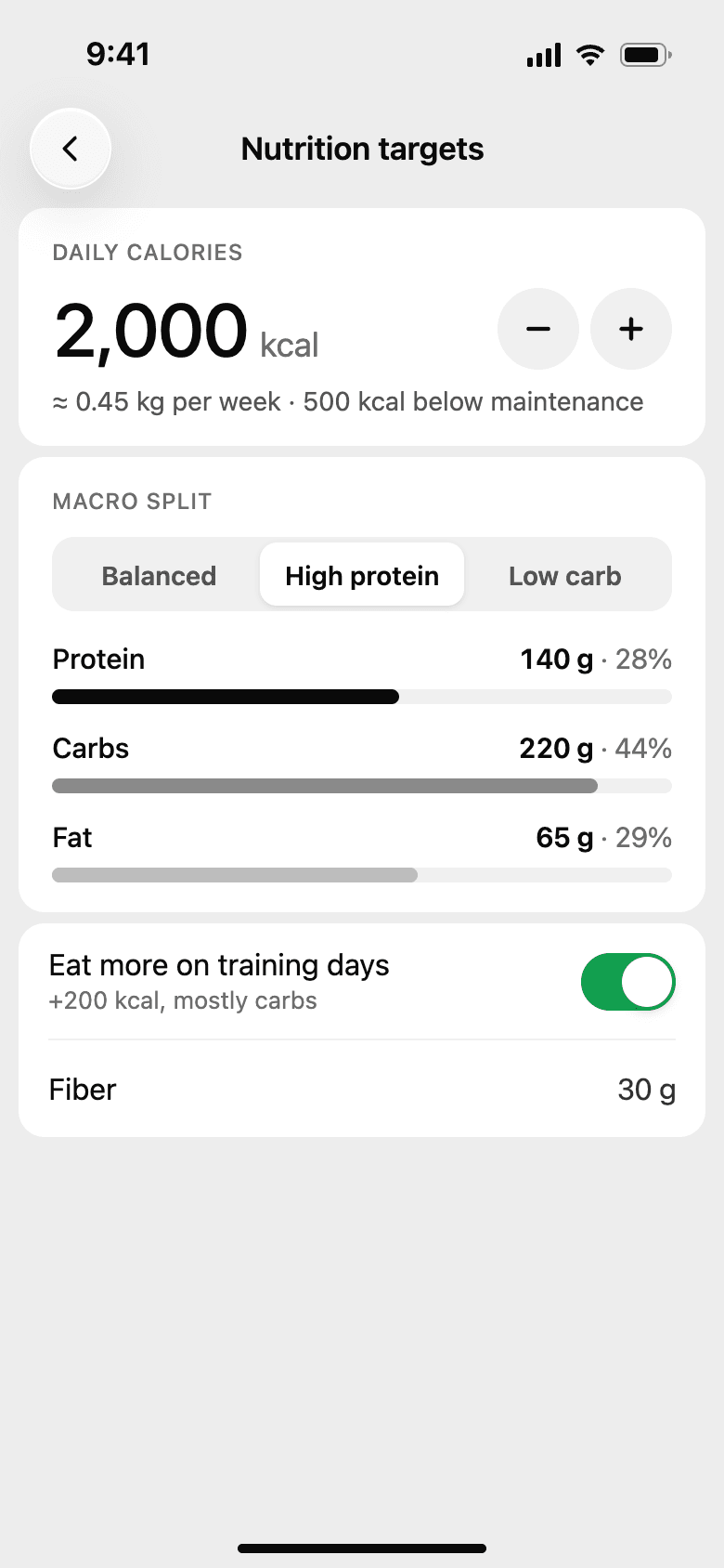
Nutrition targetsMacro presets, and more on training days. 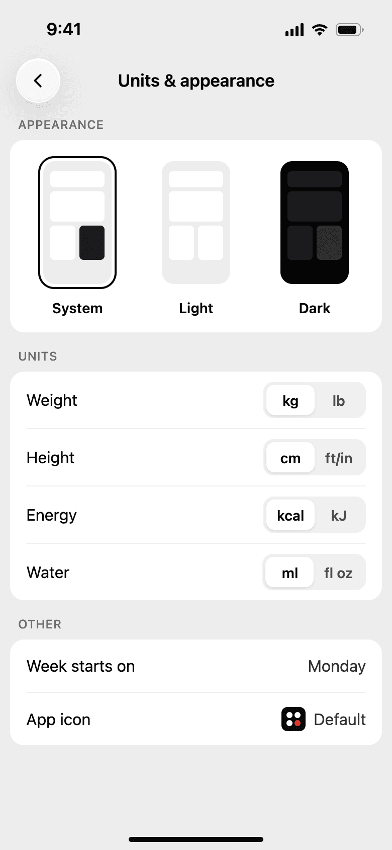
Units and appearanceMetric or imperial, light or dark. 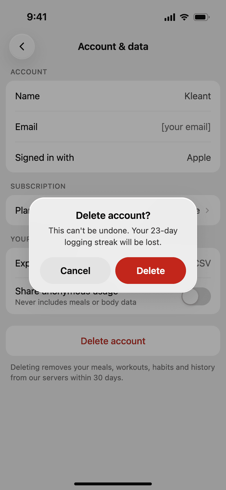
Account and dataExport, privacy, and a clear delete. 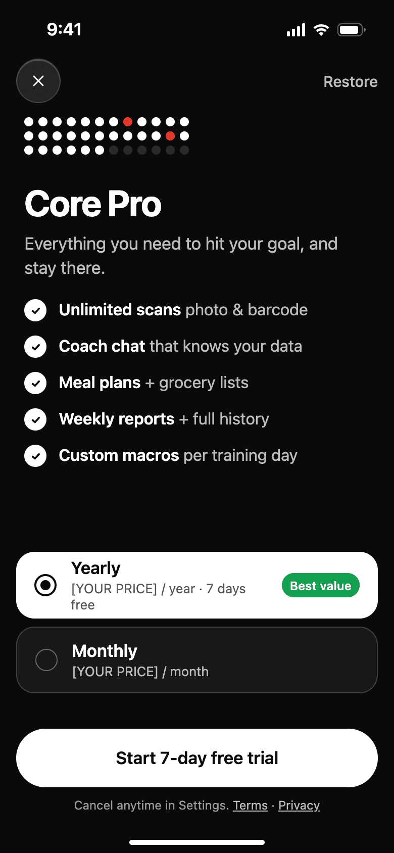
Core ProWhat's included, a free trial, how to cancel.
The visual system
The interface is black, white, and gray. Green and red only show up when something is on track or needs attention, so color always carries a meaning.
- Ink#0A0A0AType, primary actions, data
- Ground#EDEDEDScreen background
- Card#FFFFFFEvery surface that holds content
- Good#12A150On track, trending up
- Attention#E5372BMissed, over, unread
- Numbers first
- Figures use tabular digits so they stay lined up as they change. Labels are small and uppercase and stay out of the way.
- Floating controls
- The tab bar, segmented controls, and log button sit over the content in frosted glass, in line with current iOS.
- One way to show progress
- Progress is always a row of 40 ticks and habits are always a grid of dots. Learn to read them once and they work everywhere.
- Built to be used
- Main touch targets are at least 44 points, and every icon-only button has a label for screen readers.
How success is measured
The numbers that show whether the design fixes the problem.
- How many days a week people log at least two meals
- Time from tapping the plus button to a saved meal
- How often a meal scan is saved without corrections
- How many people are still logging in their fourth week
Next case study: Mood Tracker. A mood app for people who can't always put a name to how they feel, built around a check-in that takes about 30 seconds.
Planning an app like this? Send a few lines about it, see how a project runs week by week, or browse all our work.
Have something worth building?
- Product strategy
- iOS
- Design systems
- Launch sites
- Measurement
- Android
- Prototypes
- UX design
- MVPs
- Web apps
- UI design
Send a few lines about it. You will get an honest reply within two days, and a plan if it fits.