Case study · Mood TrackerPublished
A mood check-in short enough to do every day
Most mood apps ask for more than a hard day can give, and a blank journal page doesn't help when you can't name what you feel. Mood Tracker starts with faces instead of words. A check-in takes three taps, and after a few weeks the calendar starts to show patterns, like better days after a walk.
- iOS app
- Mental wellbeing
- Product design
- UX & UI
- Illustration
- Clickable prototype
At a glance
- Platform
- iOS, iPhone
- Who it's for
- People who want to understand their moods
- Our role
- Product design, UX, UI, illustration, prototype
- Year
- 2026
The problem
People start mood journals with good intentions and stop when the entries start to feel like homework. We designed for the person having a bad day. They have little energy and few words, and they need the app to ask for almost nothing.
- 01
Feelings are hard to name
Many people can't describe a feeling beyond fine or bad, and an empty text box doesn't help them find the word.
- 02
Long check-ins get skipped
On a busy or low day, anything that takes more than a minute gets skipped, and then the habit is gone.
- 03
Entries without a pattern
A list of old entries shows what happened. It doesn't show that sleep, walks, or screen time change how someone feels.
- 04
Streaks that punish
Apps that reset a streak or nag after a missed day turn looking after yourself into one more thing to fail at.
How we approached it
- 01
Faces before words
There are eight moods, each with its own face and color. Picking one means recognizing it, which is easier than finding the right word.
- 02
Three taps
Pick a mood, say how strong it is, tag what's behind it. A note is optional.
- 03
A calendar you read without numbers
Each day shows up as its face on the calendar. A good week or a rough patch is obvious before you read anything.
- 04
No penalties
One reminder a day, no streak-shaming, and goals that don't reset after a missed day.
Onboarding
The problemPeople often open a mood app on a bad day. They want to start right away, not fill in forms.
What we did
- The welcome screen asks the question people are already asking themselves: not sure about your mood?
- Sign-up says up front that check-ins are private and only the person can see them.
- People pick as many goals as they like and can change them later. The reminder screen promises one nudge a day and no streak-shaming.
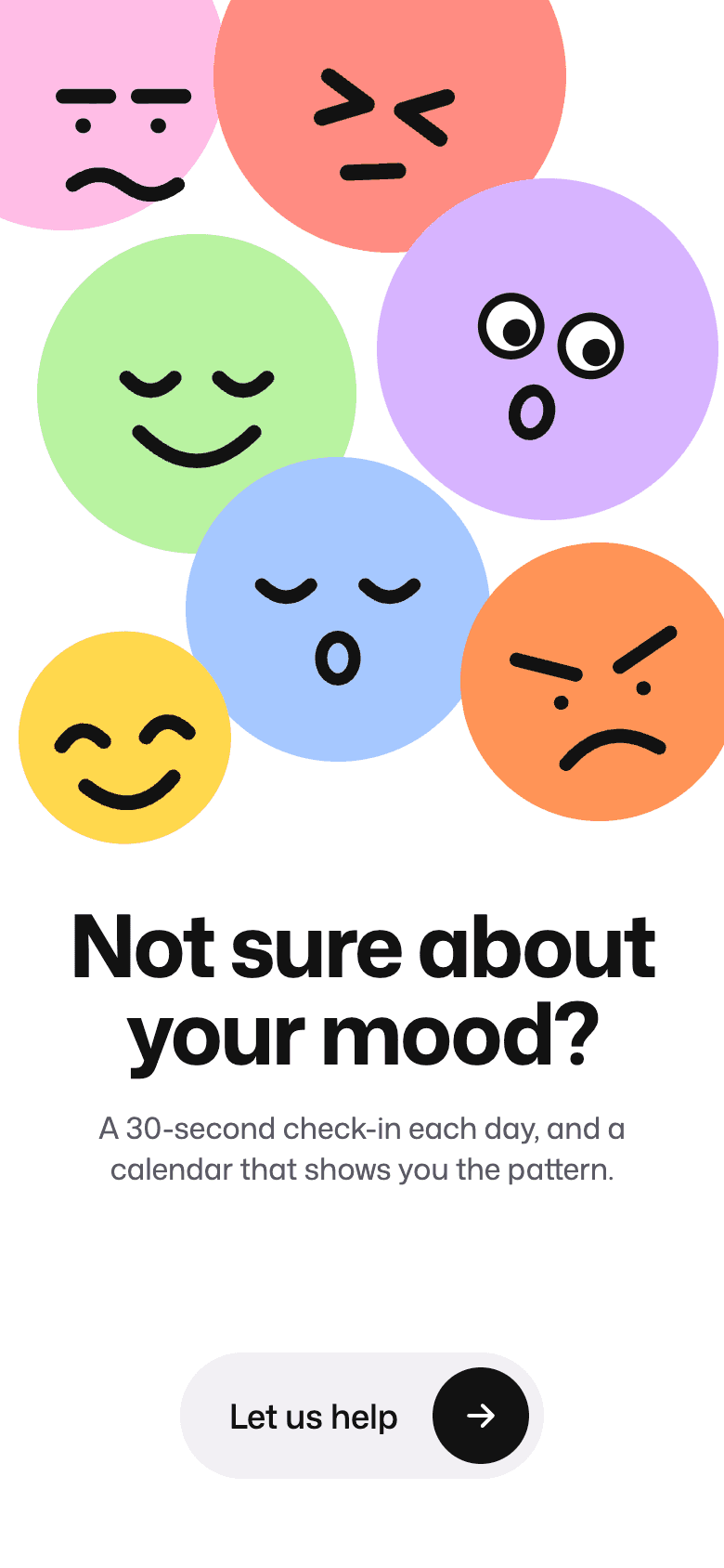
WelcomeThe question people already ask themselves. 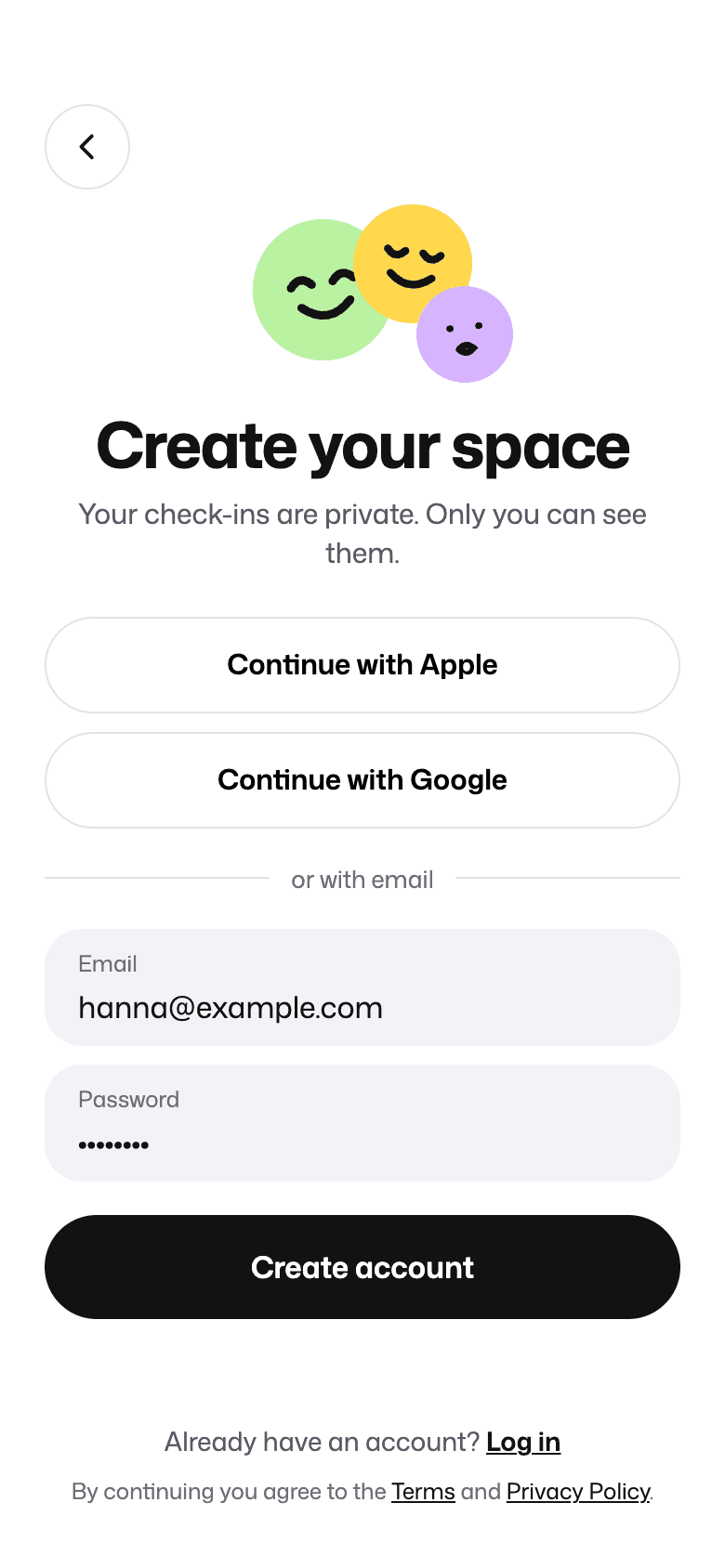
Create accountPrivate from the first screen. 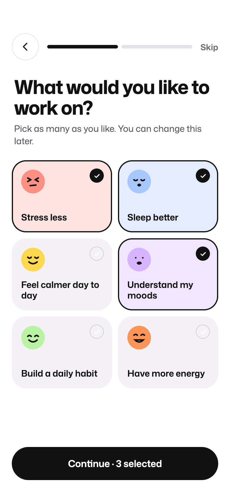
GoalsPick what to work on, change it later. 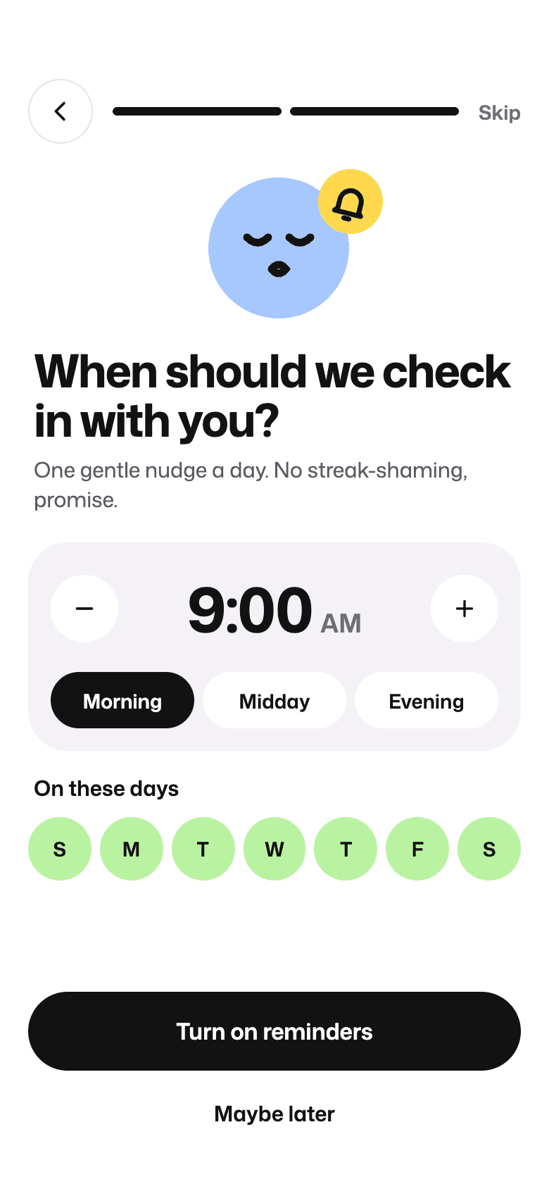
ReminderOne nudge a day, at a time that suits.
The daily check-in
The problemIf a check-in takes more than a minute, it gets skipped on exactly the days it matters most.
What we did
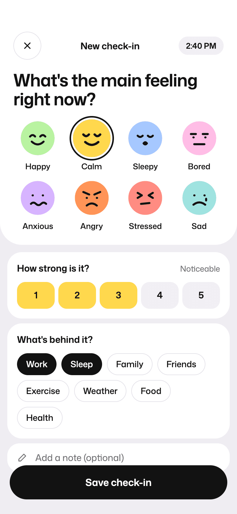
- Home opens on one question, how are you feeling today, with the mood faces right underneath.
- The whole check-in fits on one screen. Strength goes from 1 to 5 and fills with the mood's color, and tags like Work or Sleep record the cause.
- After saving, the app reflects the check-in back and offers something that fits. Work still on your mind? Try a three-minute breathing reset.
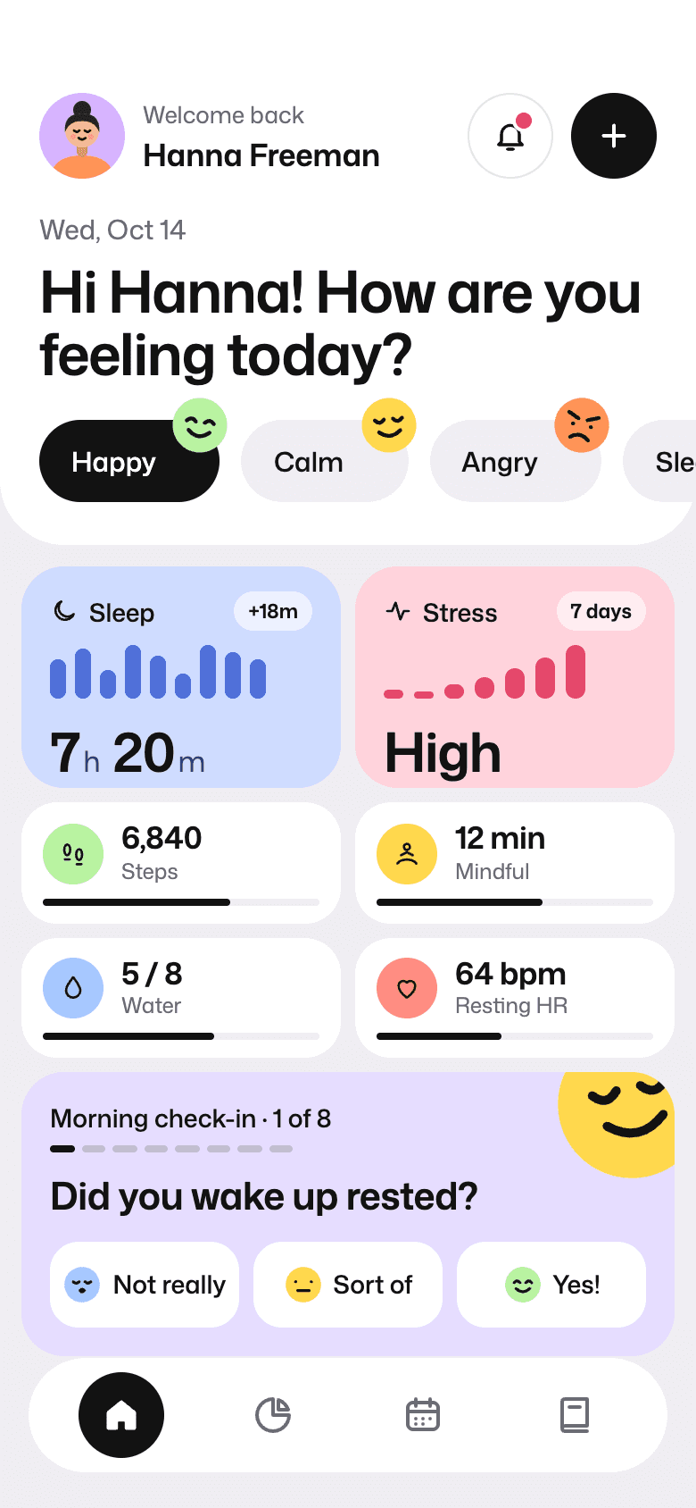
HomeToday's feeling, sleep, stress, and a morning check-in. Log a moodMood, strength, and what's behind it on one screen. 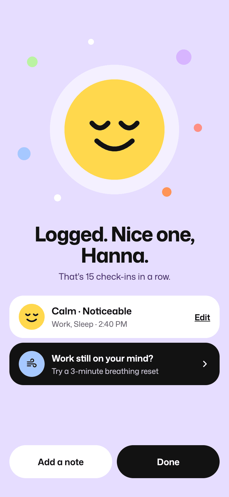
Check-in savedReflects it back and suggests what might help.
Seeing patterns
The problemWithout seeing patterns, people can't tell what actually helps.
What we did
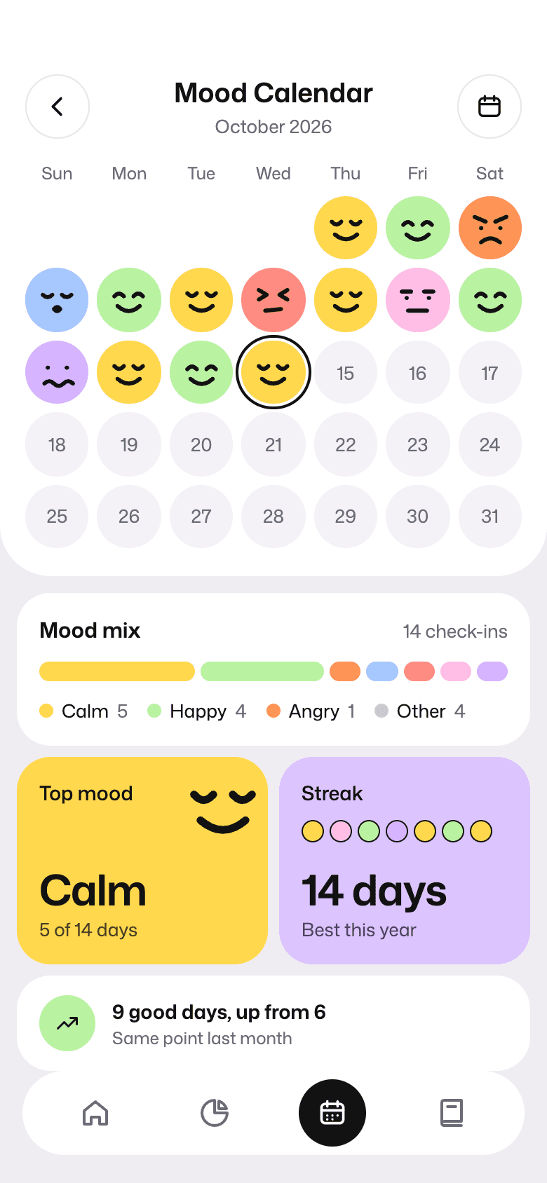
- The calendar shows the month as faces, with the mix of moods, the most common one, and the streak underneath.
- Tapping a day shows each check-in in order, plus that day's sleep, steps, and journal entry.
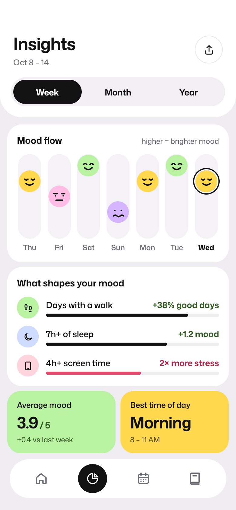
- Insights link mood to habits in plain sentences, such as more good days when there was a walk and more stress on heavy screen-time days.
- Goals count calm or happy days in a week, and missing a day doesn't reset anything.
Mood calendarA month of faces, the mix, and the streak. 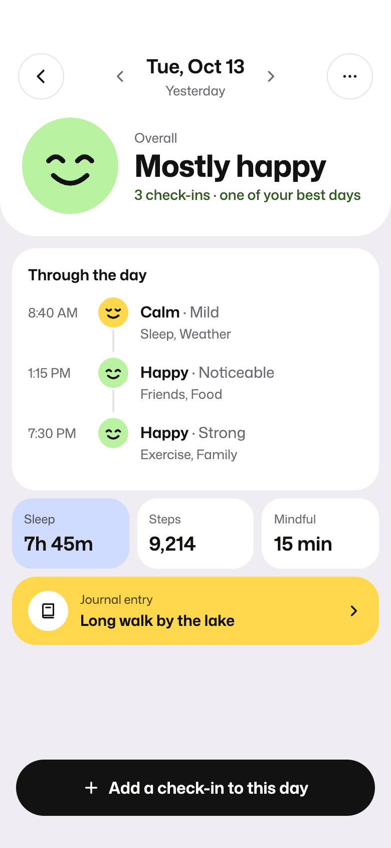
Day detailEvery check-in from one day, in order. InsightsWhat shapes the mood, in plain words. 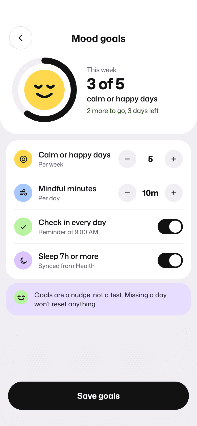
Mood goalsMissing a day resets nothing.
Help in the moment
The problemLogging that you feel anxious doesn't help much if the app has nothing to offer next.
What we did
- Explore sorts short practices by how the person feels: anxious, stressed, can't sleep, or low on energy.
- The breathing session is one screen with three patterns and a play button.
- The journal opens with a daily prompt so the page is never blank, and every entry keeps its mood and tags.
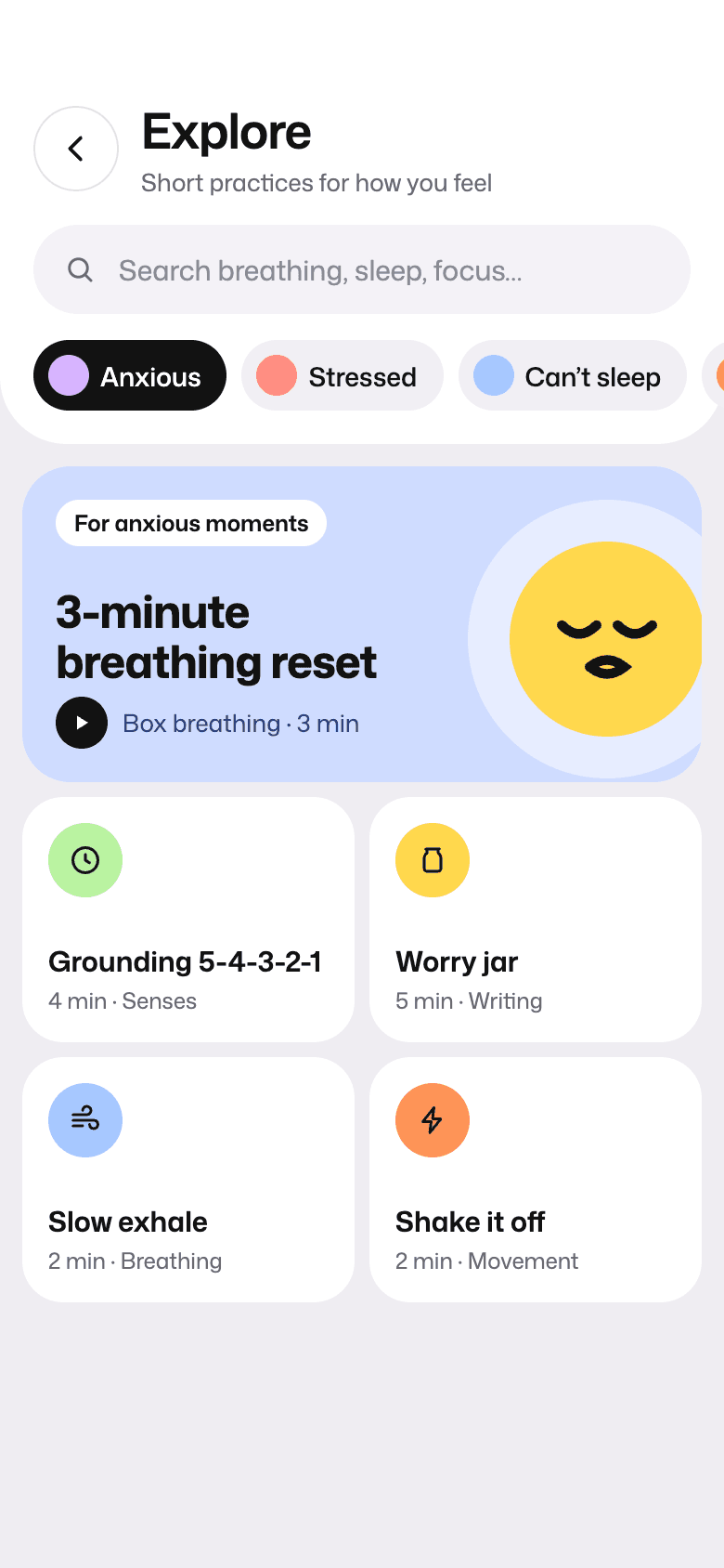
ExplorePractices sorted by how the person feels. 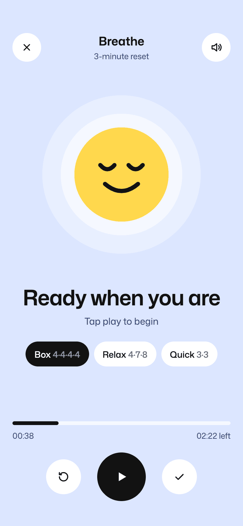
Breathing sessionThree patterns and one play button. 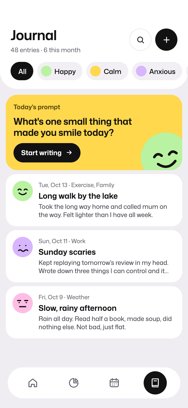
JournalEntries with their mood, filtered by feeling. 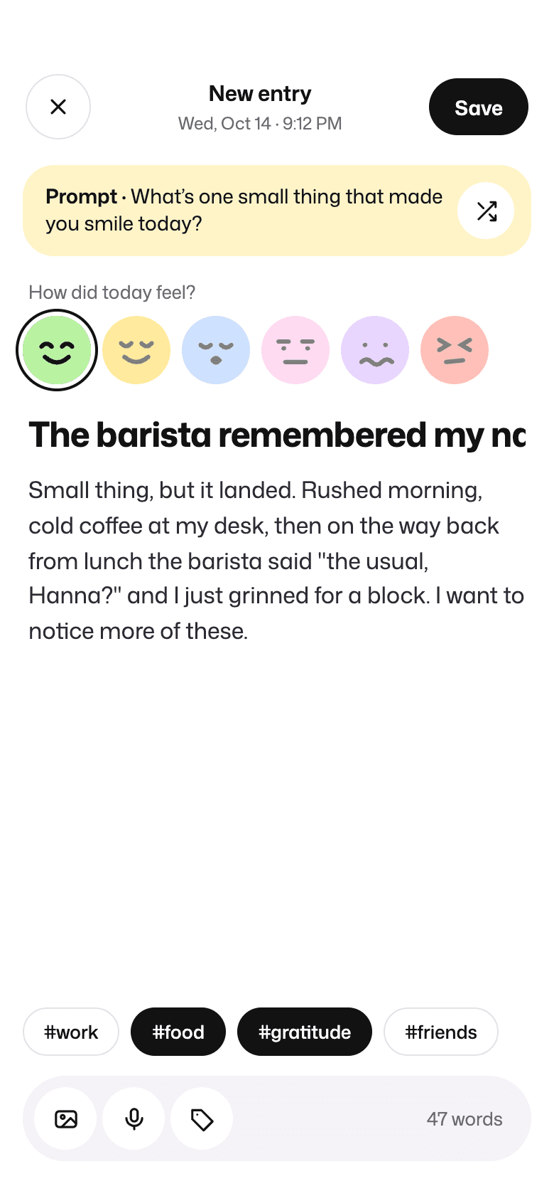
New entryA prompt, a mood, and tags.
Notifications and profile
The problemWellness notifications that make people feel guilty get muted.
What we did
- Each notification gives a reason to open the app: an afternoon check-in, a streak, a new insight, or the weekly recap.
- The profile shows check-ins, best streak, and journal entries, with export and delete kept under Privacy.
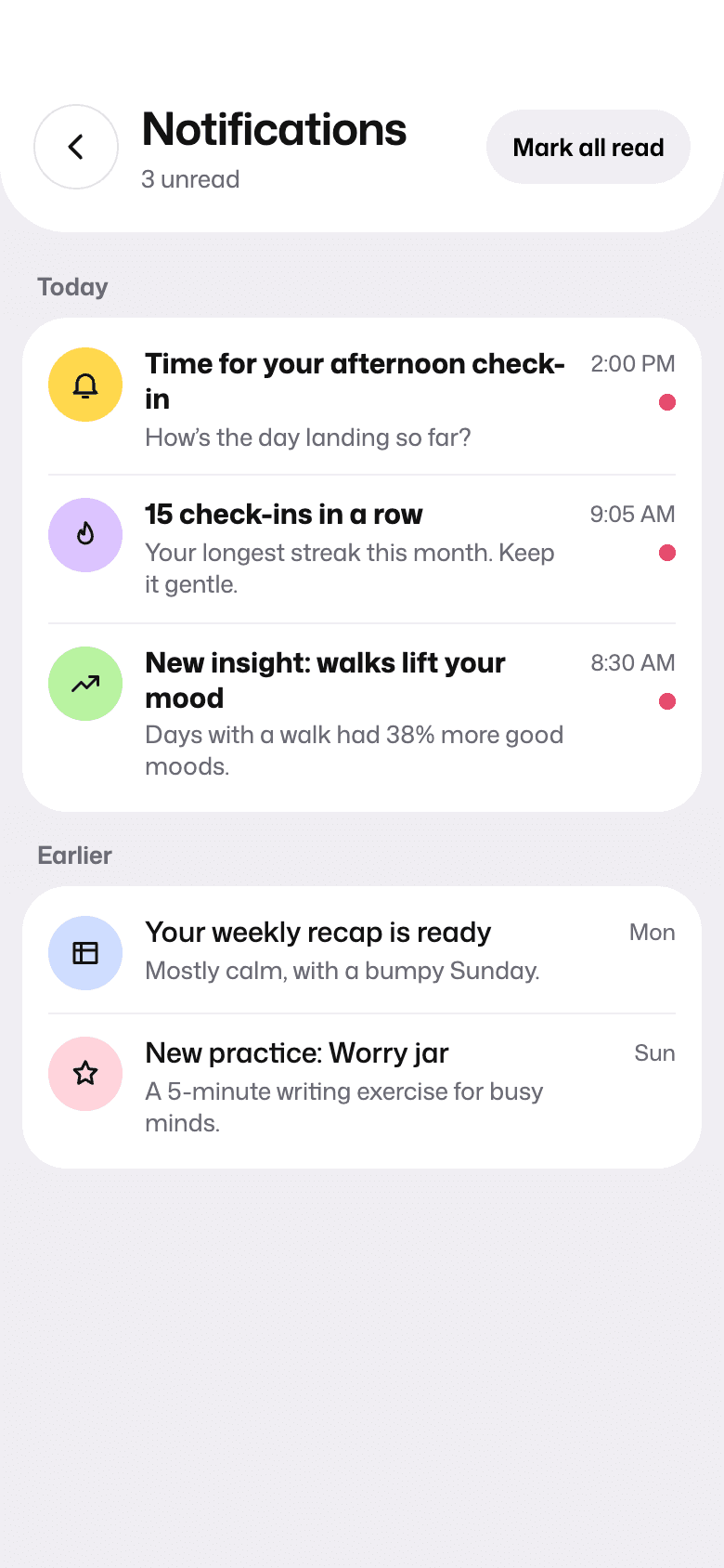
NotificationsCheck-ins, streaks, insights, and the weekly recap. 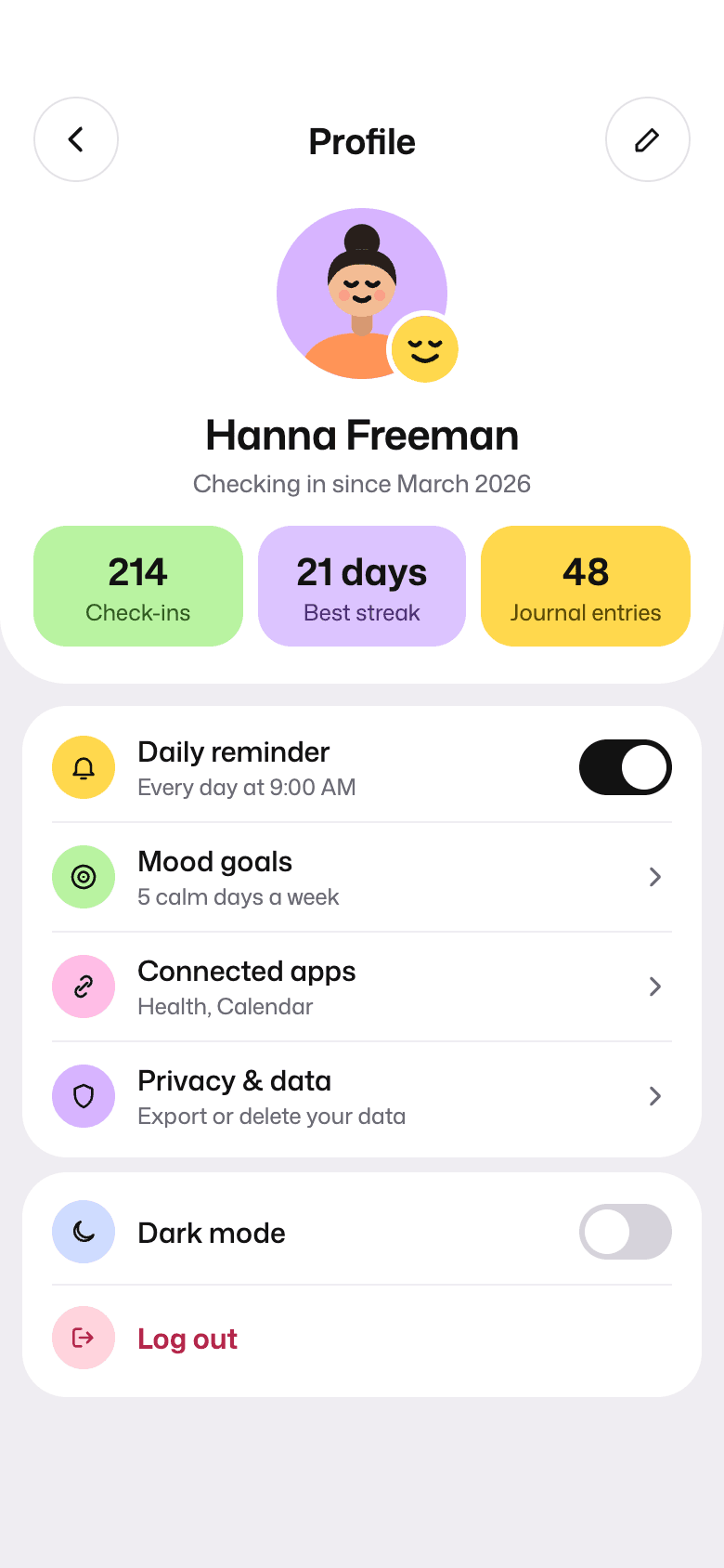
Profile and settingsProgress, reminders, connected apps, and privacy.
The visual system
The faces carry the emotion, so the layout stays quiet: white cards on a pale background, one typeface, and black for actions.
- Ink#121212Type, primary actions, navigation
- Ground#EFEDF2Screen background under the cards
- Happy#B9F3A1
- Calm#FFD84D
- Sleepy#A6C8FF
- Bored#FFBDE6
- Anxious#D7B4FF
- Angry#FF9457
- Stressed#FF8C82
- Sad#9FE3E0
- Faces instead of icons
- Each mood is a drawn face in its own color. The same eight faces are used in the check-in, the calendar, the journal, and the insights.
- Soft cards
- White and tinted cards sit on a pale background, with large corner radii and a floating tab bar.
- Questions lead
- Each screen opens with a large question set in Mona Sans. You always know what the app is asking.
- Built to be used
- Main touch targets are at least 44 points, icon-only buttons are labeled, and each day on the calendar is described in words for screen readers.
How success is measured
The numbers that show whether the design fixes the problem.
- How many people check in at least five days a week
- Average time to finish a check-in
- How many people come back after missing a few days
- How often a practice or insight gets opened after a check-in
Next case study: Binario. A train ticket app for Italy that puts regional, airport, and high-speed trains in one timetable, with tickets that work as soon as they're bought.
Planning an app like this? Send a few lines about it, see how a project runs week by week, or browse all our work.
Have something worth building?
- Product strategy
- iOS
- Design systems
- Launch sites
- Measurement
- Android
- Prototypes
- UX design
- MVPs
- Web apps
- UI design
Send a few lines about it. You will get an honest reply within two days, and a plan if it fits.